A Platform Built for Enterprise Scale
State Street’s internal portfolio management platform had grown organically over several years, accumulating inconsistent interaction patterns, fragmented workflows, and a visual language that varied screen by screen. The platform served over 55,000 institutional and retail investors globally — but the interface reflected the ad-hoc decisions of multiple teams working without a shared system.
The product spanned the full lifecycle of investment management: real-time market monitoring, portfolio rebalancing, trade execution, performance attribution, order management, tax-lot tracking, and compliance reporting. Each of these workflows had its own design logic. Switching between them felt like using seven different applications.
Beneath the product surface, a deeper organisational problem had taken hold. Fifty-plus offshore designers across five countries were working from inconsistent Sketch files with no shared component library, no contribution guidelines, and no review process. UI regressions were shipping to production weekly.
Complexity Without Clarity
The fundamental problem was not any single broken screen. It was a platform that had never been designed as a whole. Three issues defined the scope.
1. Workflow Fragmentation
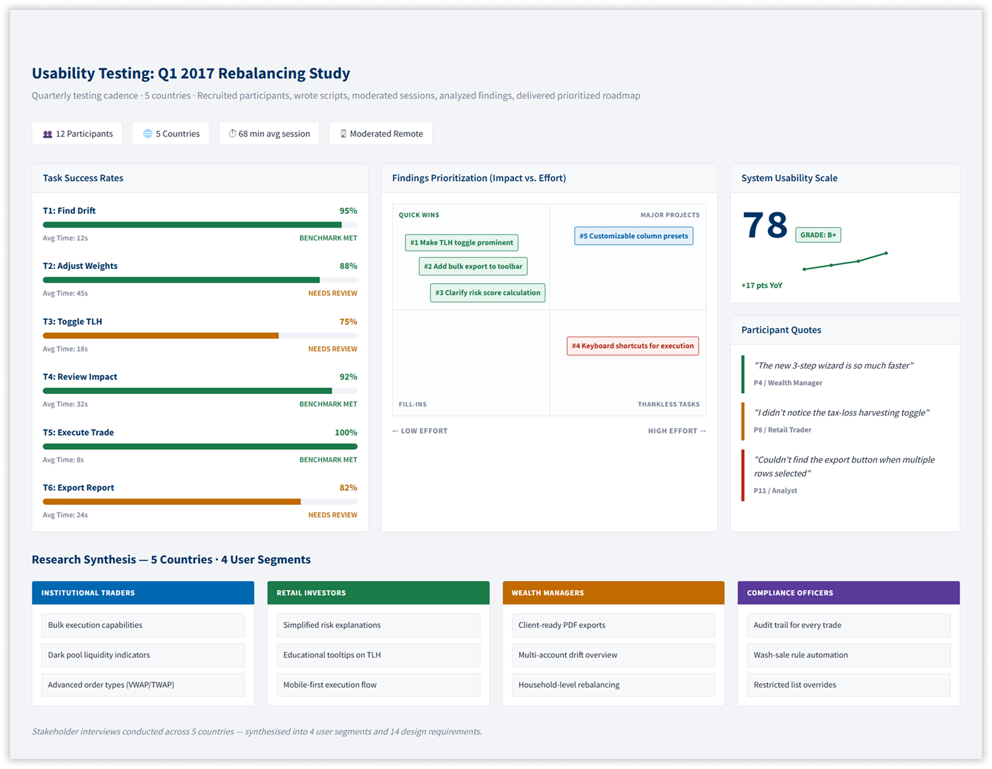
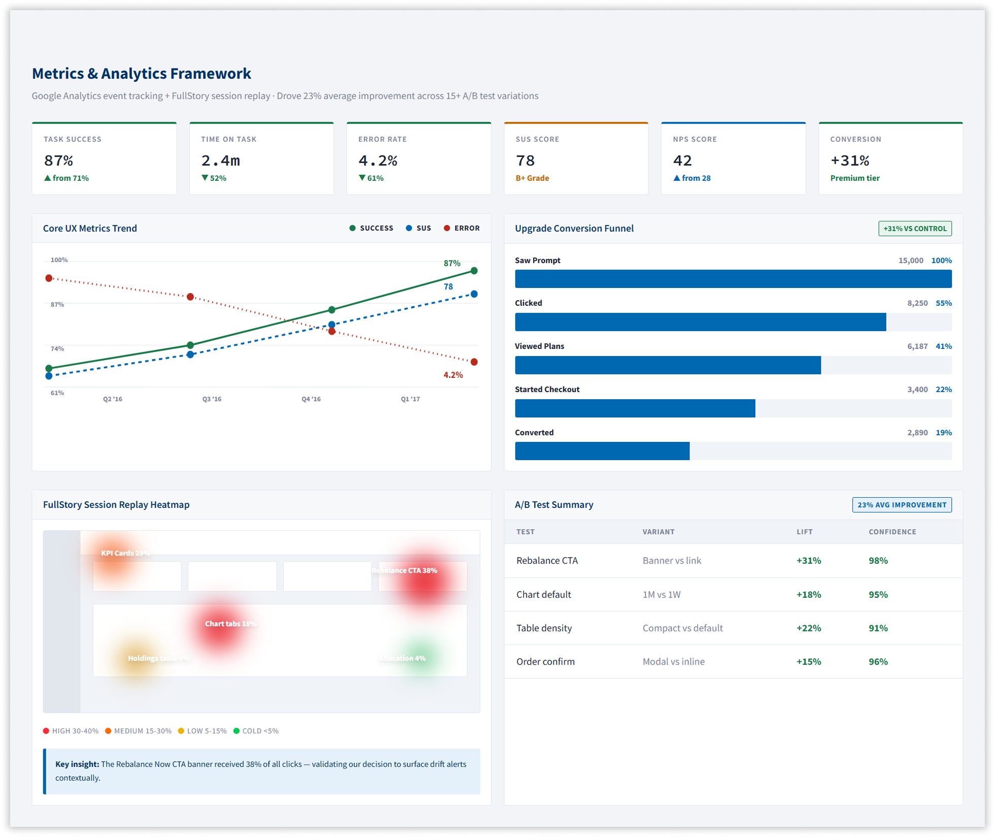
Portfolio rebalancing — one of the most used flows on the platform — required seven steps, four confirmation screens, and multiple context switches between tools that should have been one continuous experience. Usability testing confirmed a task completion time of over four minutes, with an error rate above 12%.
2. No Design Foundation.
With 50+ designers working from local Sketch files, every team had drifted from every other. Button styles, alert colours, table patterns, and form inputs had all diverged. There was no single source of truth.
3. No Mobile Presence
The platform had no native mobile offering. Wealth managers and institutional traders reviewing positions or approving trades outside the office were accessing a desktop interface on a 4-inch screen.
A Unified Trading Dashboard
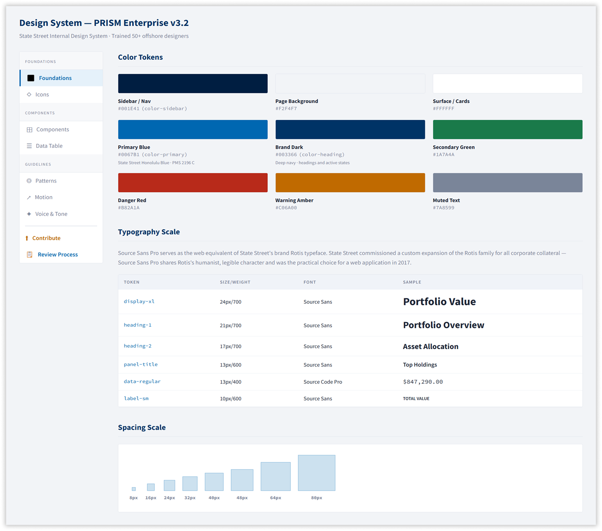
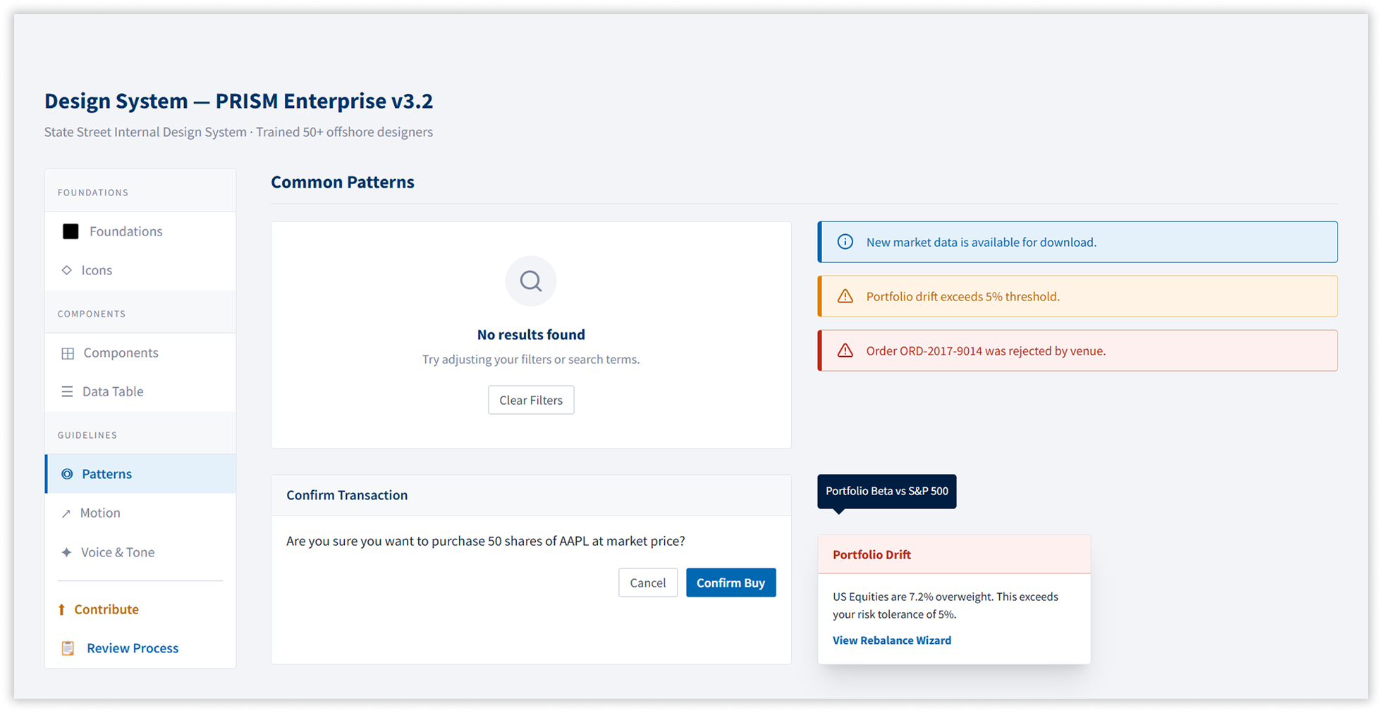
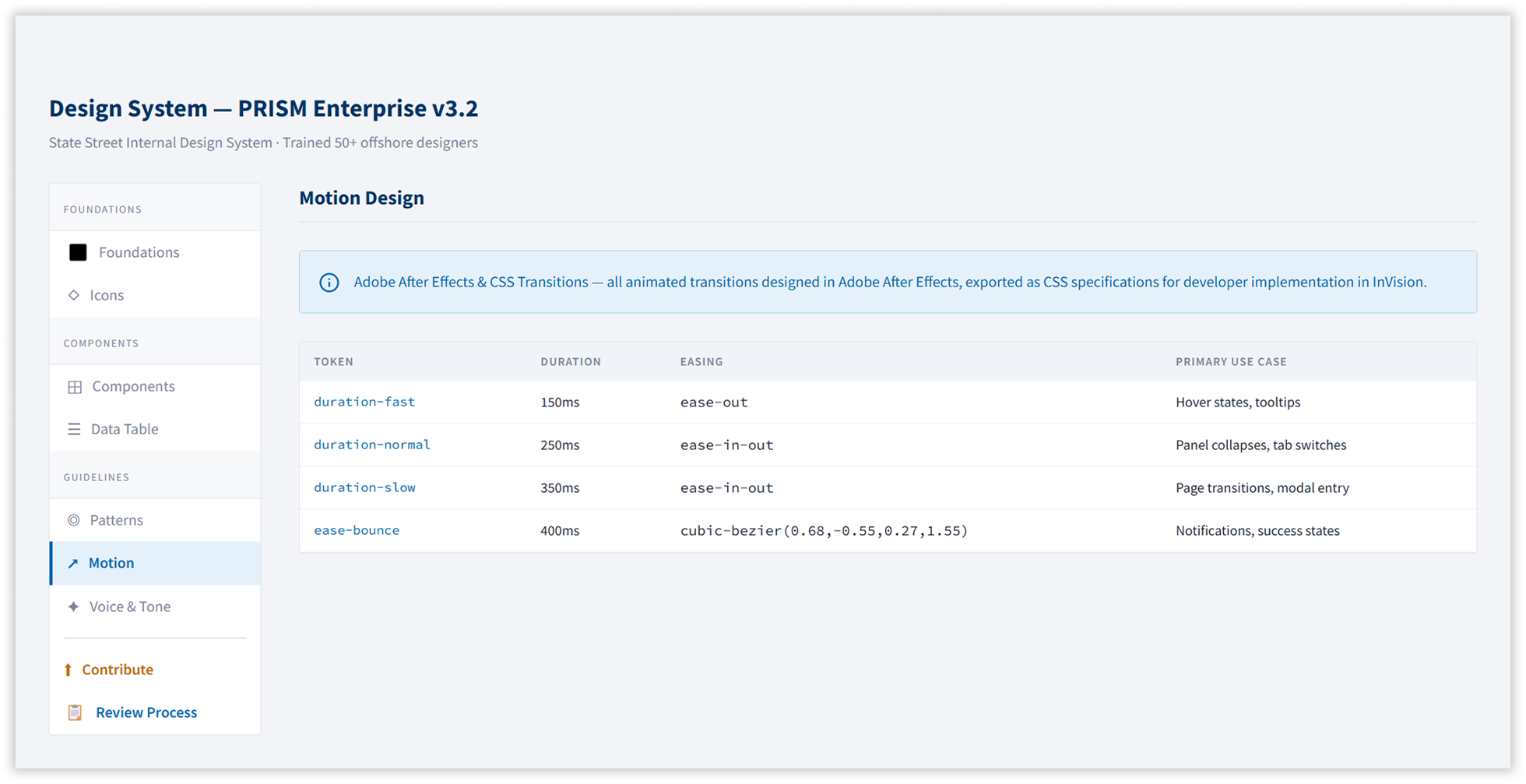
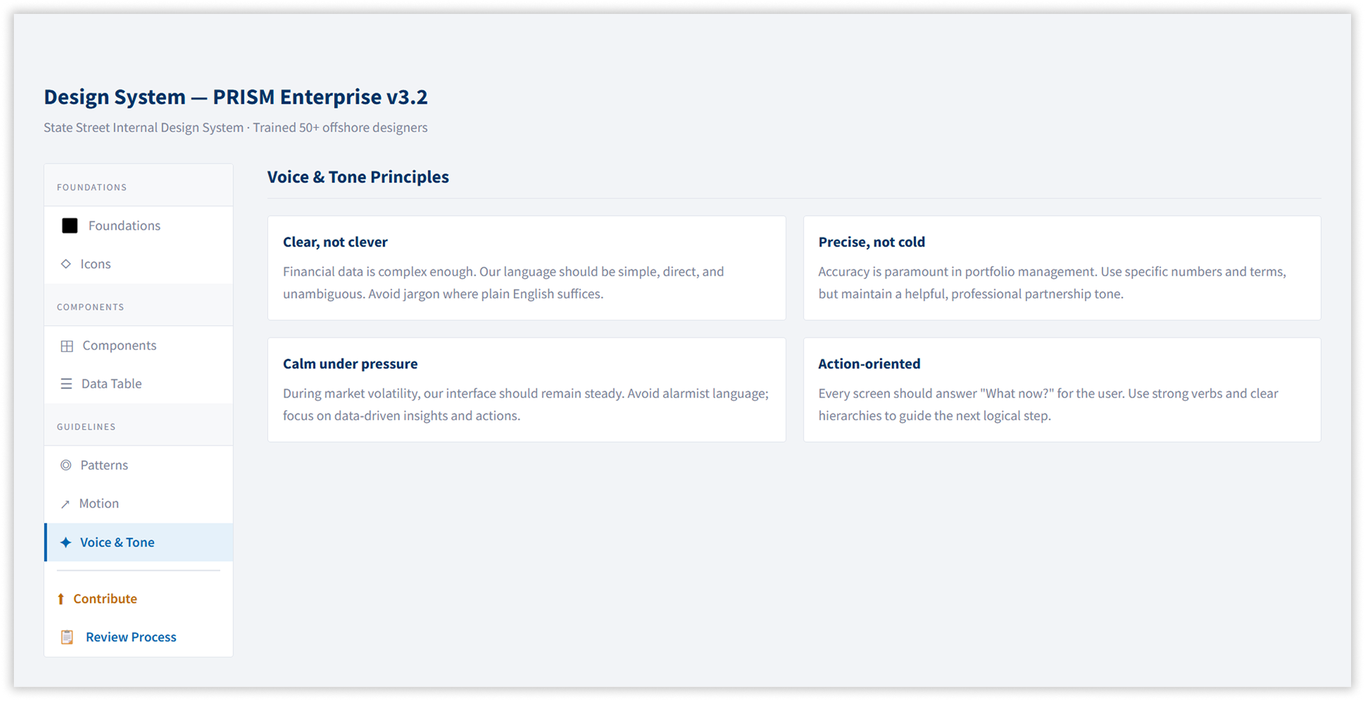
1. PRISM Design System v3.2
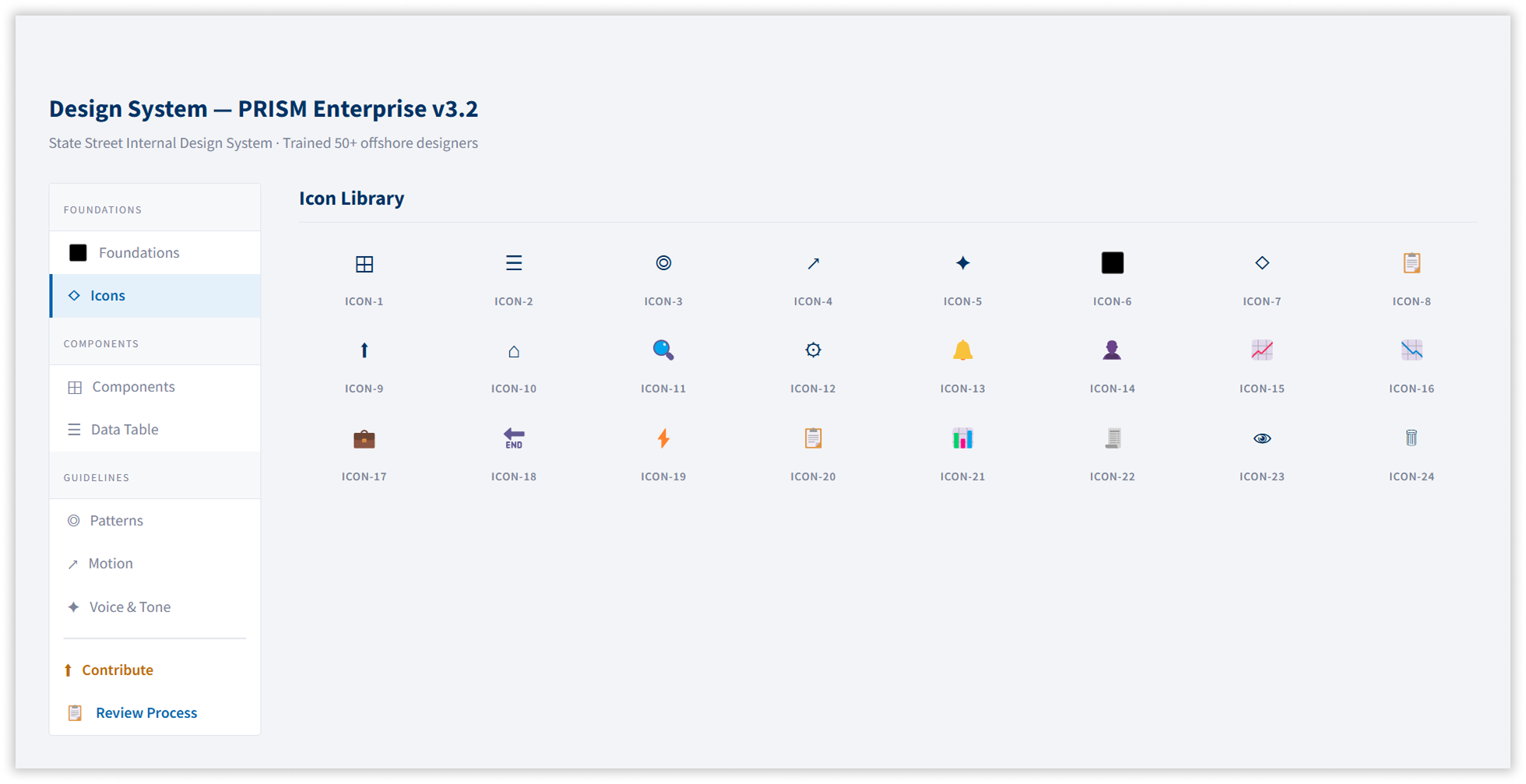
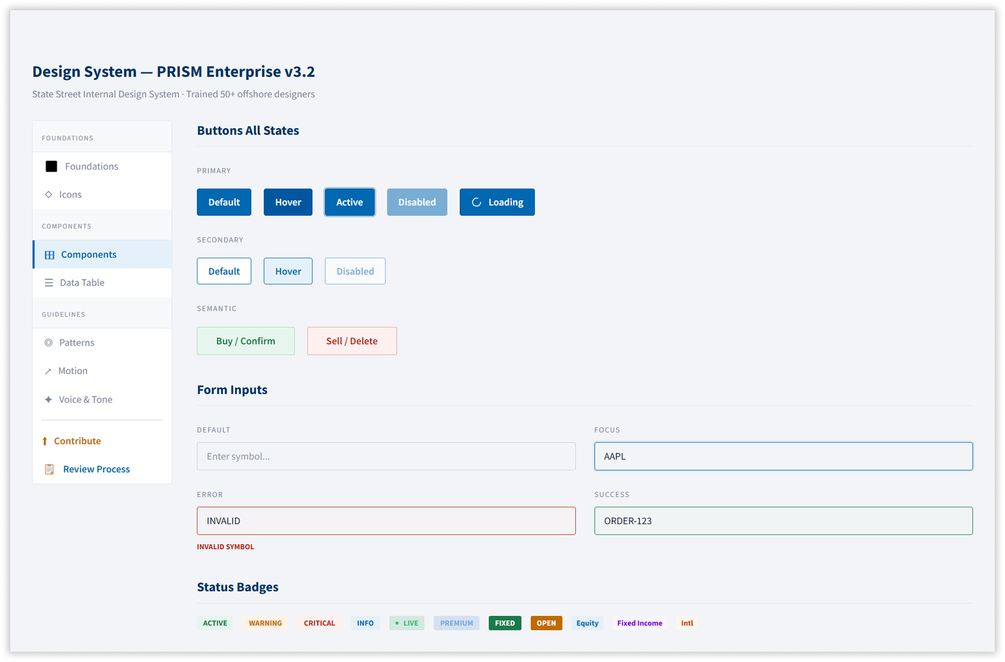
A complete component library built in Sketch and documented across seven sections: colour tokens, typography (Source Sans Pro for UI, Source Code Pro for financial data), spacing, iconography, components, interaction patterns, and motion specifications. A contribution model and review process were rolled out to 50+ offshore designers across five countries, ending the weekly UI regression cycle entirely.
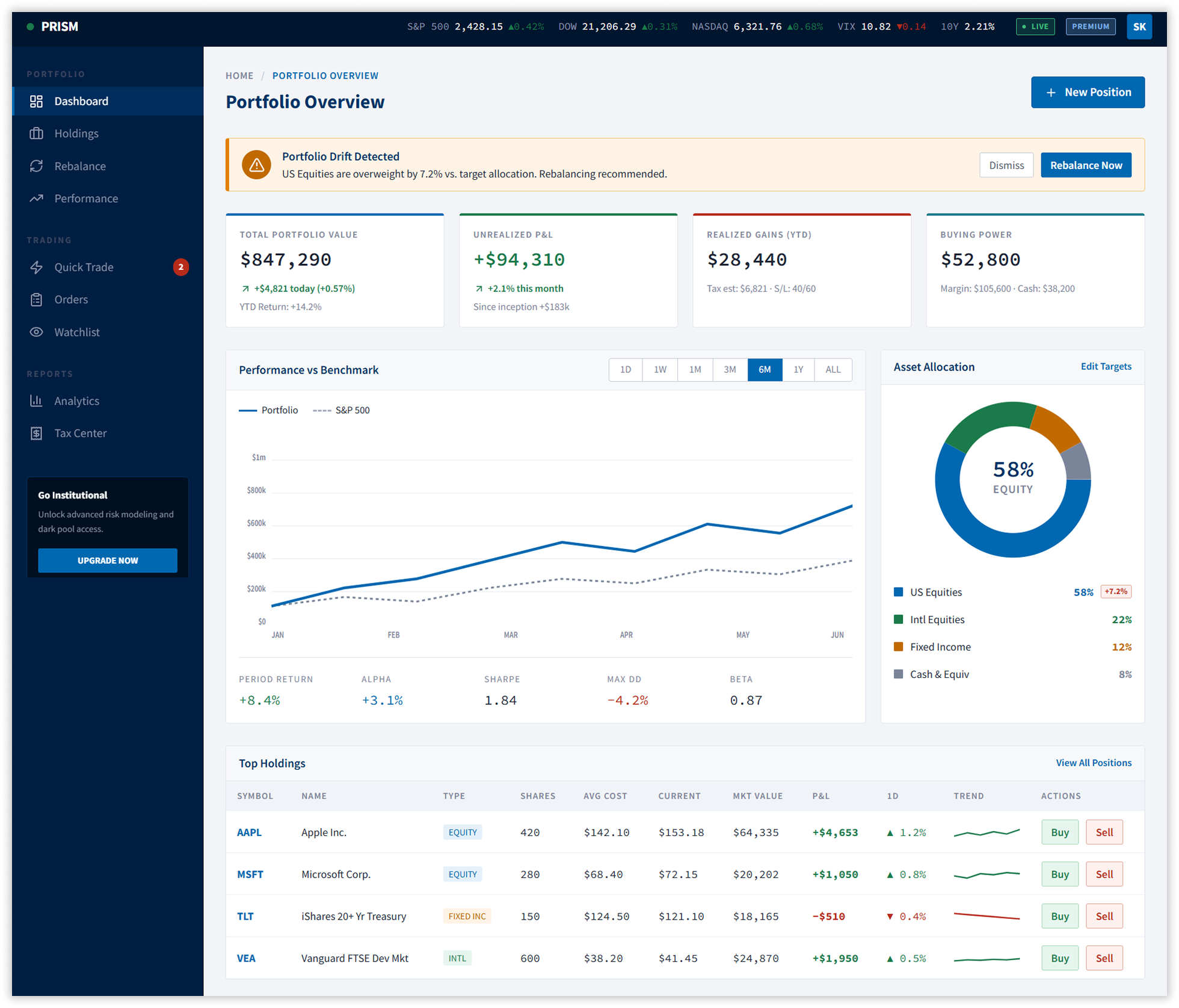
2. Dashboard & Contextual Drift Alerts
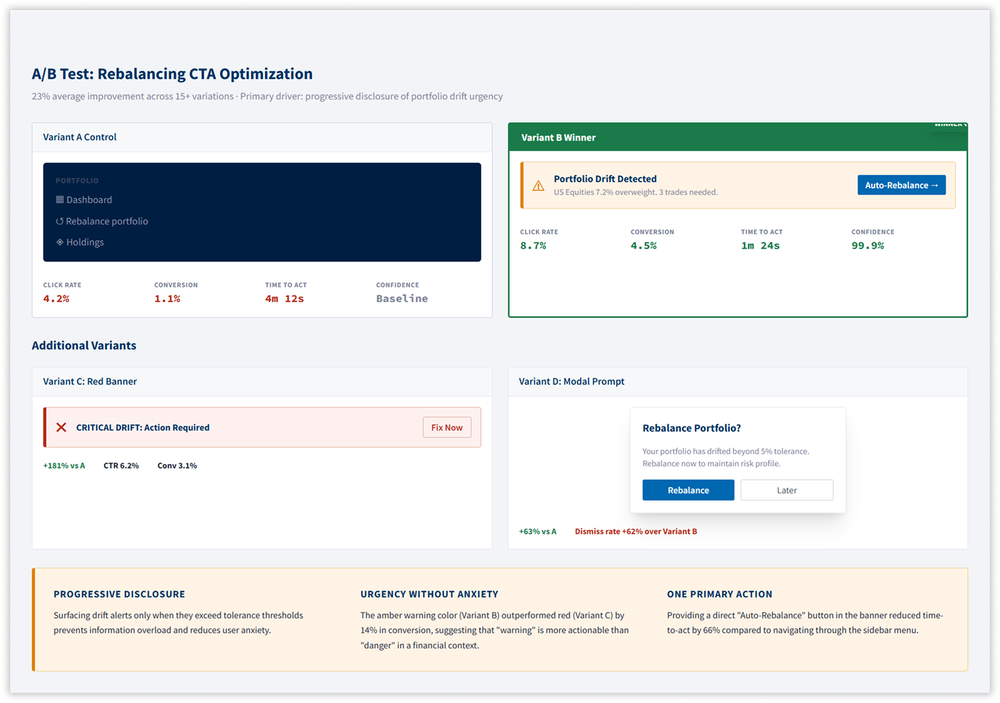
The rebalancing prompt was removed from the sidebar and redesigned as a contextual amber alert banner on the dashboard — surfacing the specific drift percentage, naming the asset class, and offering an inline “Rebalance Now” CTA. A/B testing confirmed this single change drove a 31% lift in premium conversions at 99.9% statistical confidence.
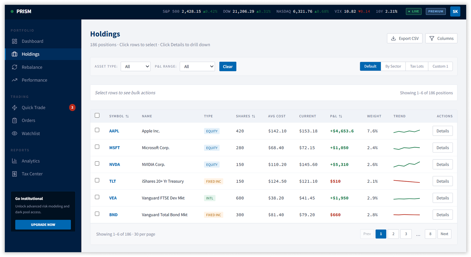
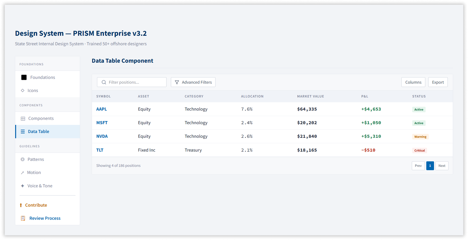
3. Advanced Holdings Table
Rebuilt from scratch: inline editing, bulk actions with contextual toolbar (appearing only on row selection), multi-column sorting, filter panels, saved views, row-level sparklines, and CSV export. Clicking any row’s Details button opens an in-page drill-down with a 6-month price history chart and direct position actions — reducing the need to navigate away from the table entirely.
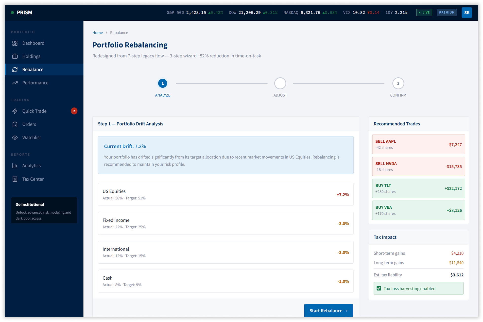
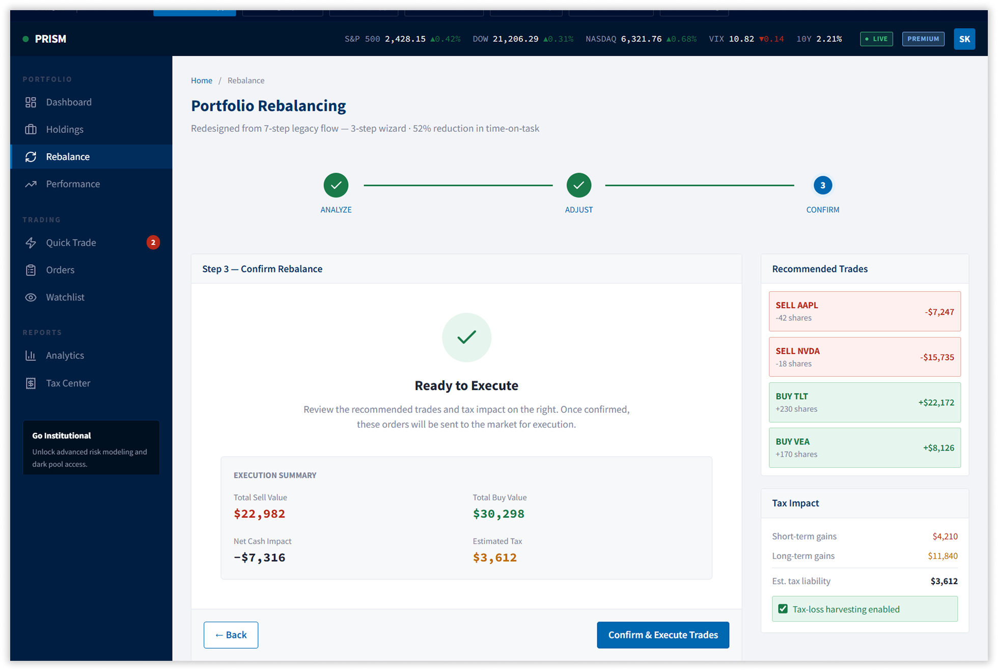
4. Portfolio Rebalancing — From 7 Steps to 3
The legacy multi-step form was restructured into a 3-step wizard: Analyse, Adjust, Confirm. Drift was visualised as target-versus-actual comparisons with interactive sliders updating recommended trades in real time. Tax-loss harvesting was elevated from a buried setting to a first-class toggle visible throughout the wizard. Time-on-task dropped 52%. Error rate fell from 12% to under 5%.
5. Full Platform Coverage
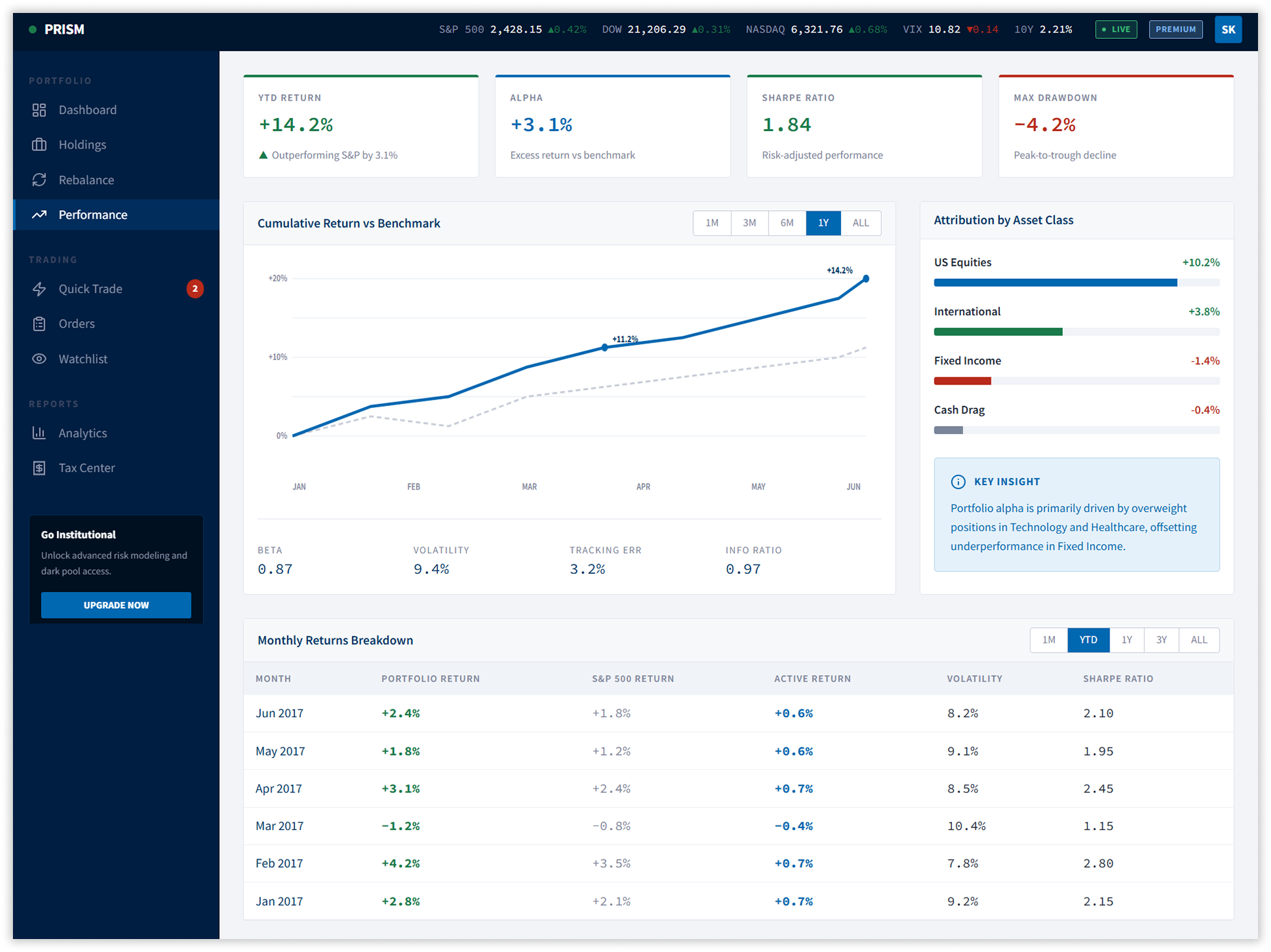
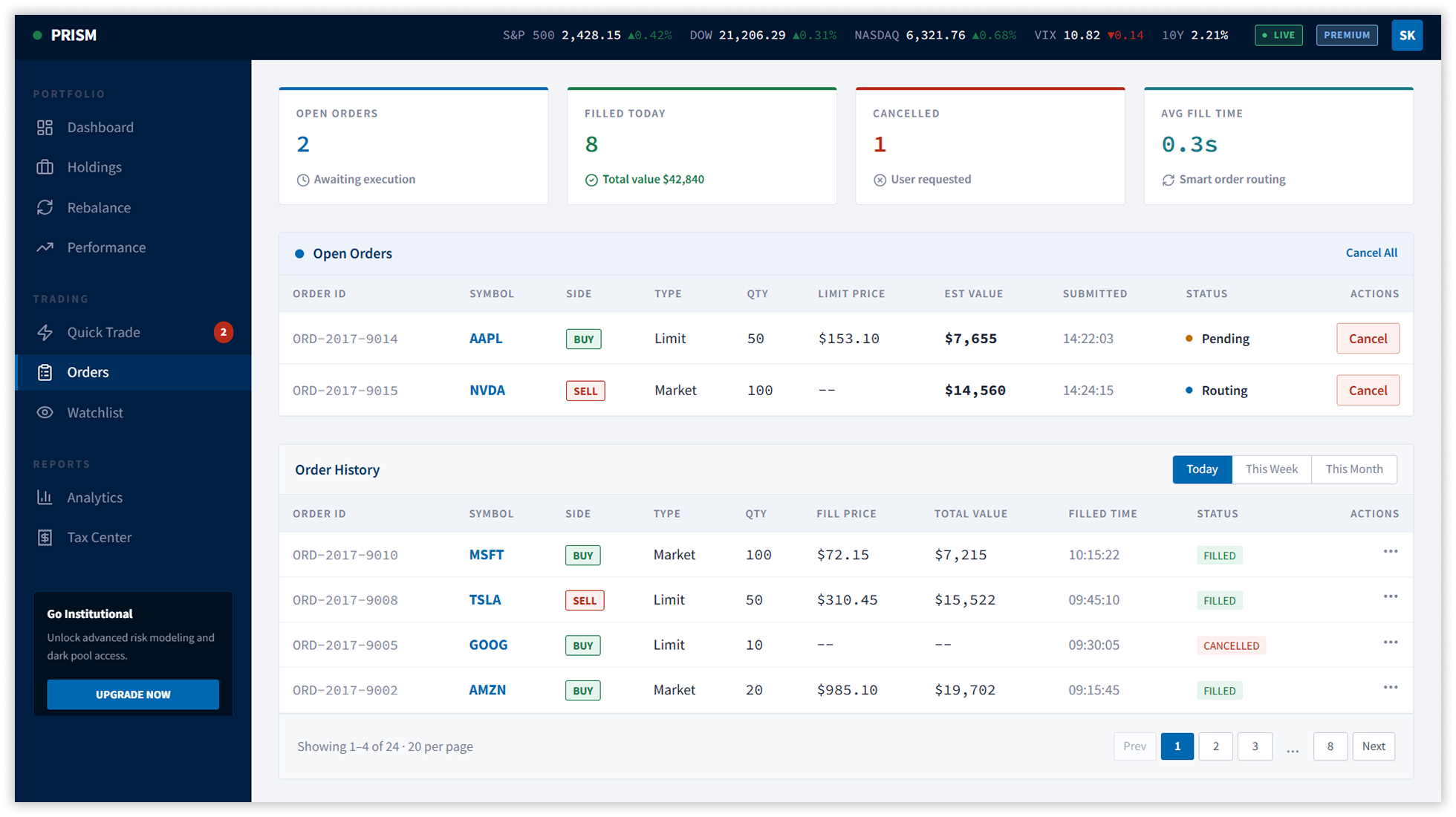
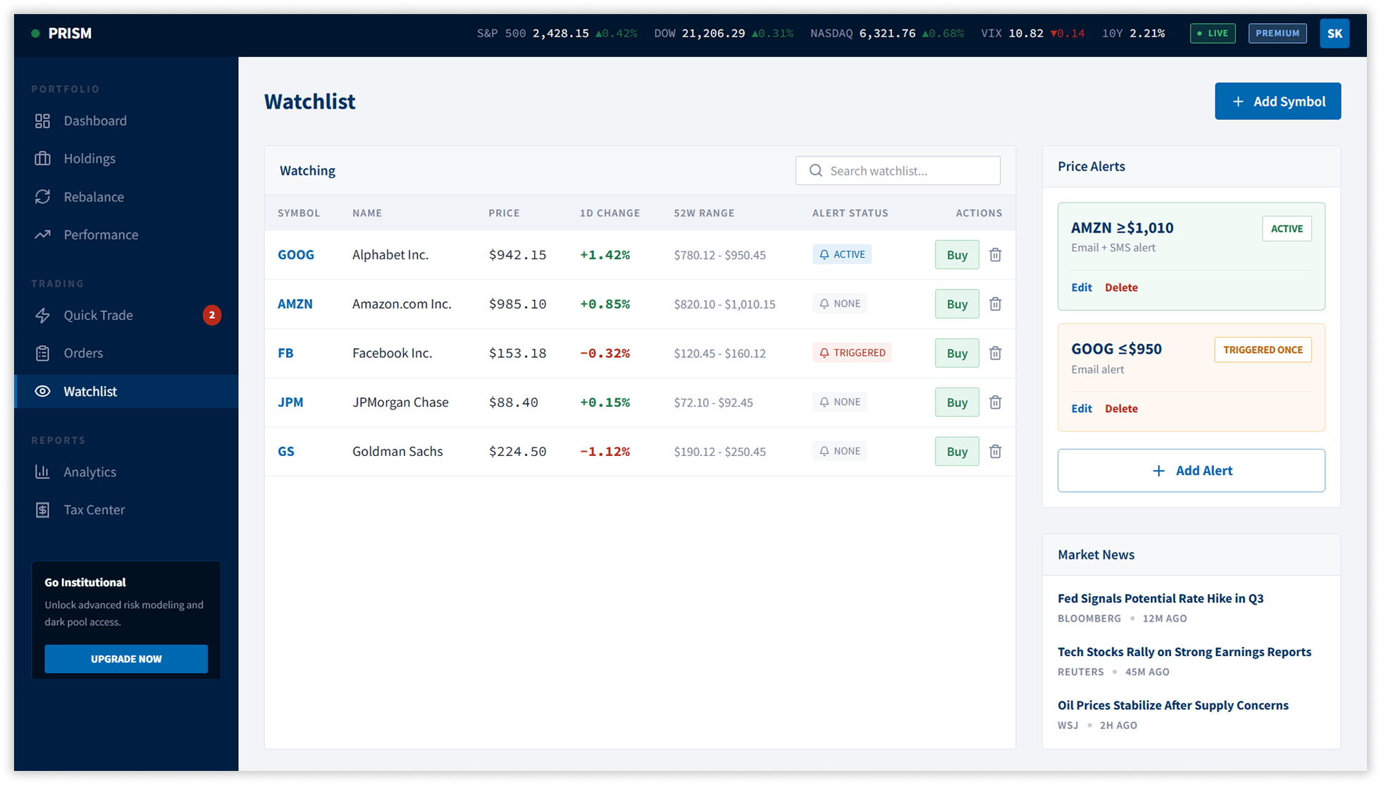
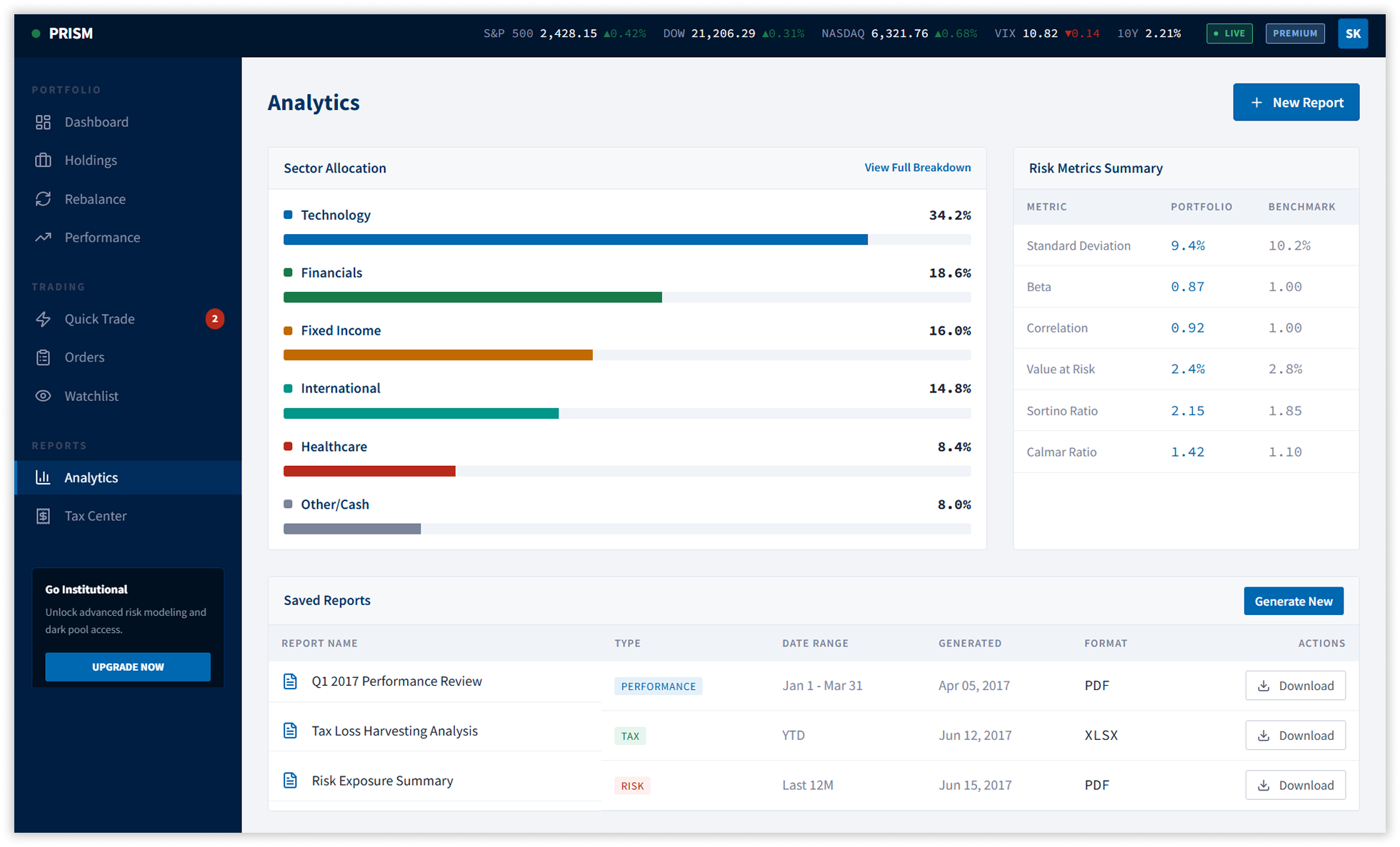
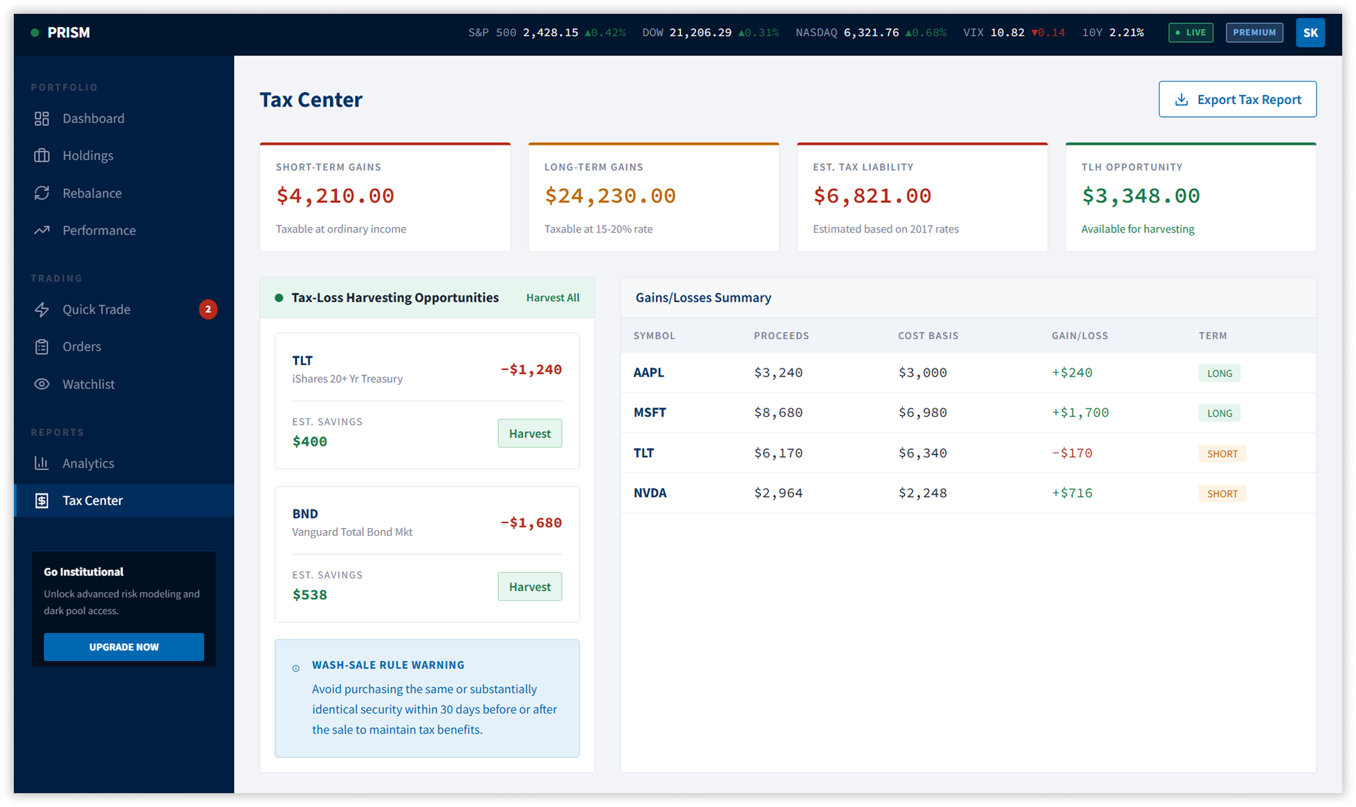
Five additional screens were designed to complete the platform: a Performance Analytics module with monthly attribution tables, benchmark comparison charts, and risk metrics (Sharpe, Sortino, Calmar, VaR); an Order Management screen with live open order tracking, cancellation, and full order history with filtering; a Watchlist with price alerts, market news feed, and one-tap trade initiation; an Analytics & Reports centre with sector allocation breakdowns and saved compliance reports; and a Tax Center with tax-loss harvesting recommendations, gains/losses ledger, and wash-sale rule guidance.
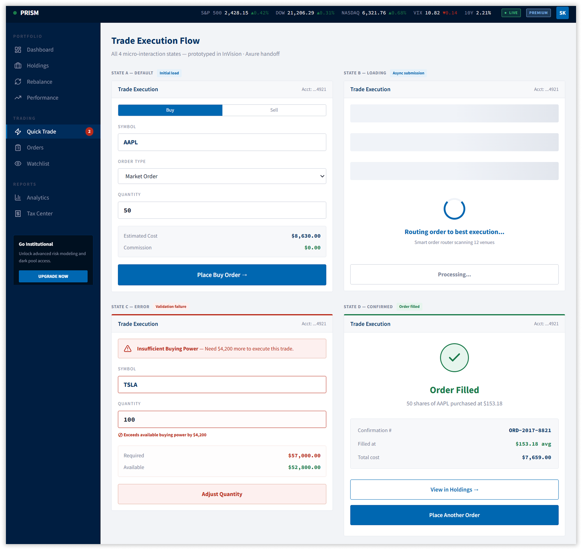
6. Trade Execution — All Four Interaction States
The trade modal was prototyped in InVision to demonstrate all four states developers needed for implementation: Default input form, Loading with smart order routing indicator scanning 12 venues, Error with inline validation and buying power comparison, and Success confirmation with order number and position update. This eliminated the ambiguity that had previously caused development teams to ship inconsistent states.
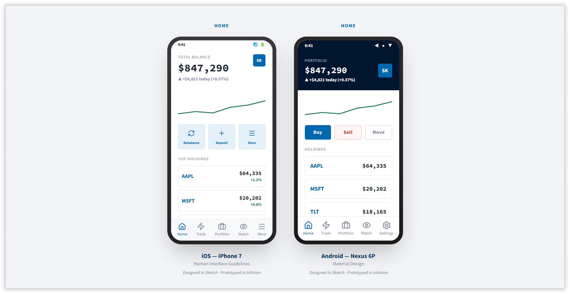
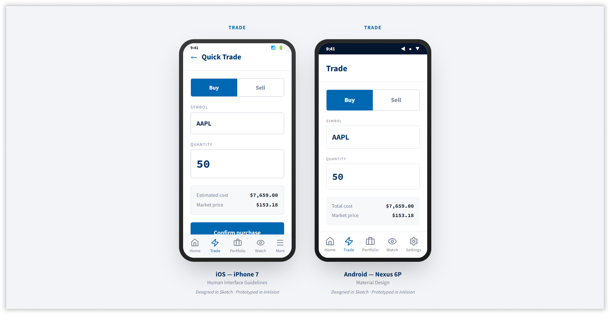
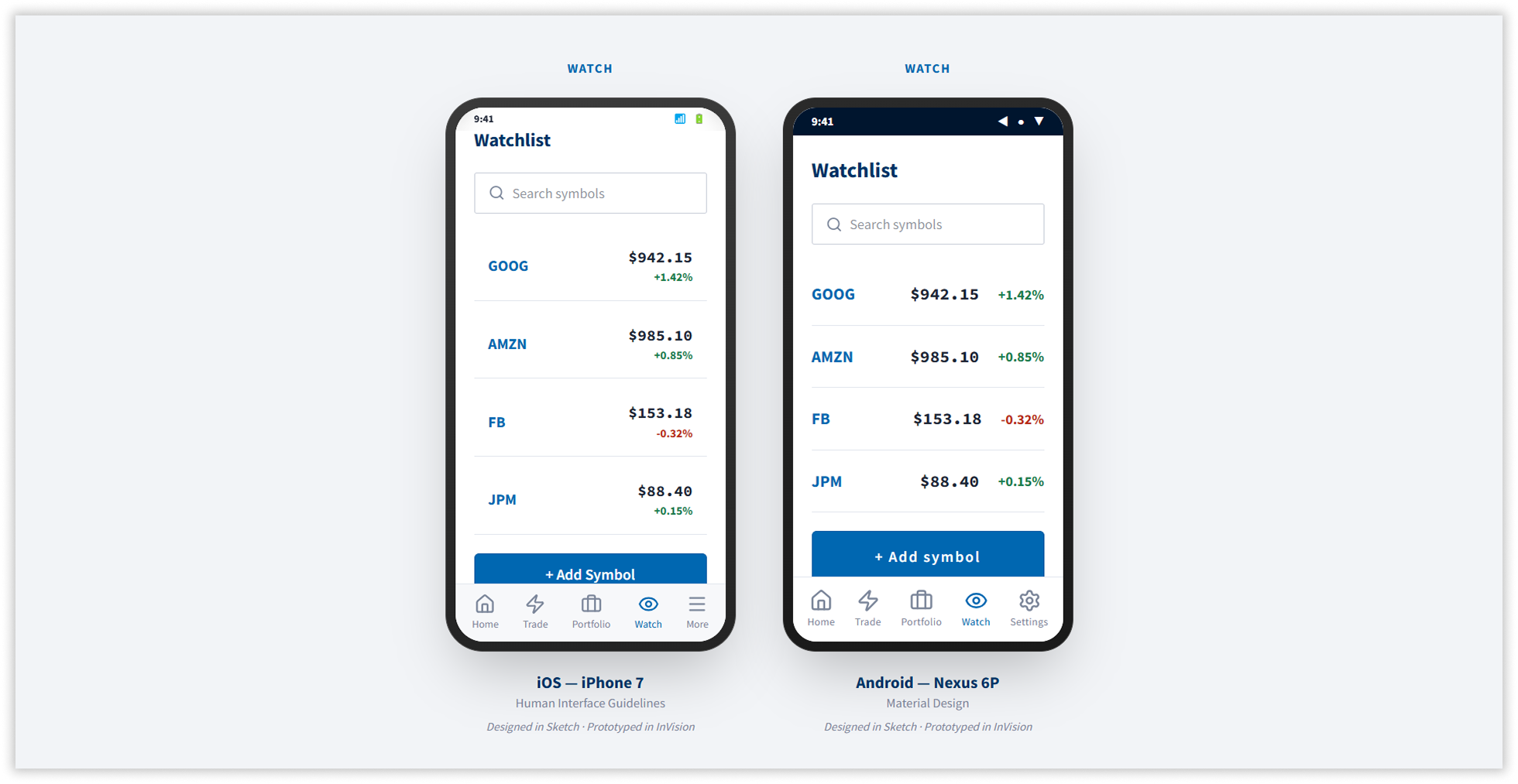
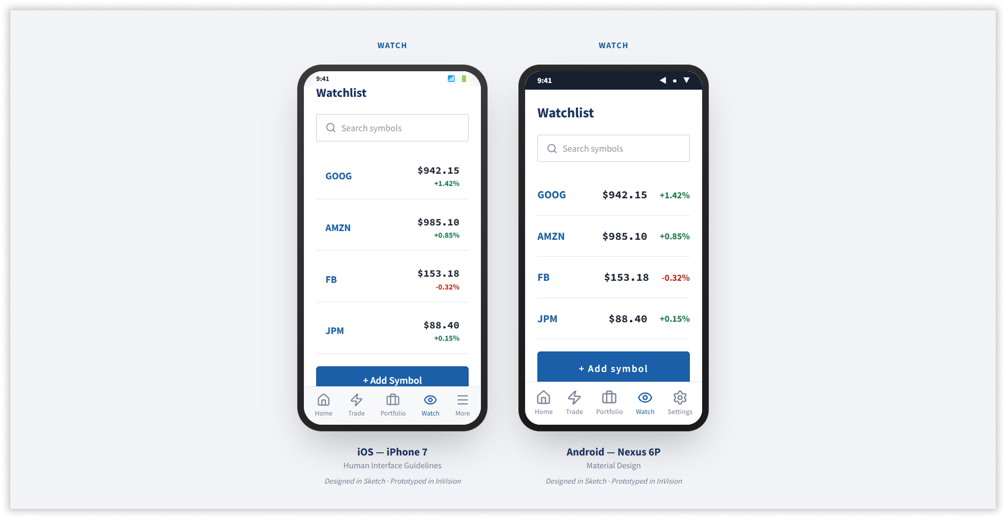
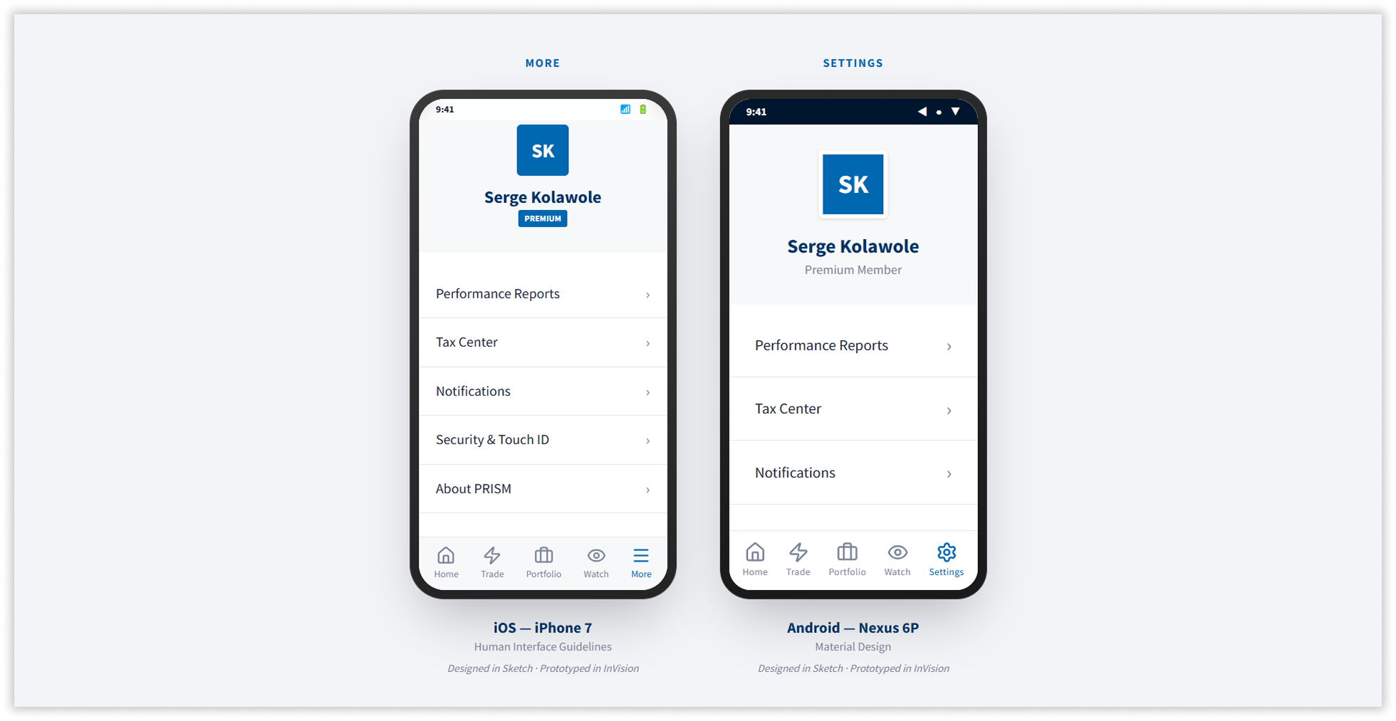
7. Mobile — iOS and Android Native Design
Native companion apps designed for iPhone 7 (Human Interface Guidelines) and Nexus 6P (Material Design). Both share PRISM’s design token system while using platform-appropriate navigation. Five screens per platform: Home, Trade, Portfolio, Watchlist, and Settings.
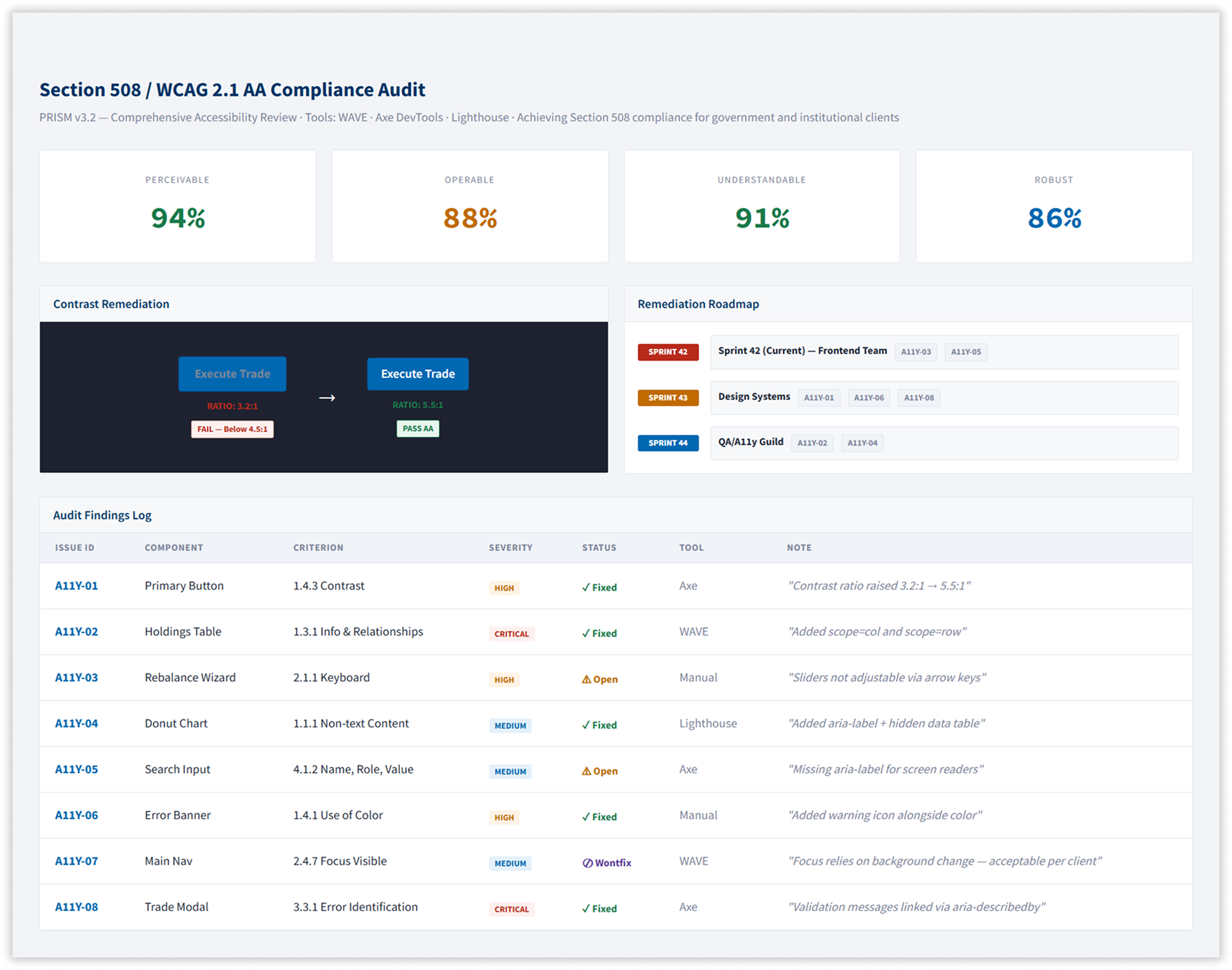
8. Accessibility — Section 508 Compliance
A formal audit using WAVE, Axe DevTools, and Lighthouse identified eight violations. All critical and high-severity issues were resolved across three sprints, bringing the platform to full AA compliance — a contractual requirement for government and institutional accounts.
Measurable Improvement Across Every Benchmark
A quarterly testing programme tracked outcomes from Q2 2016 to Q1 2017 across usability, engagement, and conversion.
FullStory session replay confirmed the strategic decision behind most of these results — the Rebalance Now CTA banner captured 38% of all dashboard clicks. The design system ended the UI regression cycle entirely. Average improvement across 15+ A/B variations was 23%.
The design system resolved the organisational problem entirely. With contribution guidelines in place and 50+ designers trained, the team eliminated the weekly UI regressions that had previously shipped to production. PortfolioIQ v3.2 now underpins every new feature delivered to 55,000+ users across institutional and retail markets worldwide — with governance, accessibility, and performance standards built into the foundation rather than retrofitted after the fact.
Three Decisions That Shaped the Outcome
The most important design decision in this project was not a visual one. It was the decision to build the design system before touching any individual screen. Without that foundation, every screen-level improvement would have drifted within two sprints, exactly as the previous designs had.
The second most important decision was treating the rebalancing CTA as a research problem rather than a design preference. The A/B test result was not obvious in advance — the red banner had higher raw CTR than the amber one. Without the conversion data, a reasonable designer could have concluded that more urgent = better. The data showed that in a financial context, anxiety suppresses completion.
The third was scope. A redesign that covered only the most-requested screens would have left the holdings table, tax center, order management, and analytics in their original state — creating the same seam problem in a different place. The decision to treat the platform as a whole rather than a collection of screens is what made the SUS improvement sustainable rather than temporary.
