Fragmented Analytics Tools Hindering Business Intelligence, IBM Watson
Senior UI/UX Designer | November 2020 – Present
60% reduction in task time
NPS increased from 34 to 81
01. The Context
Fragmented Analytics Tools Hindering Business Intelligence
IBM Watson Analytics serves over 50,000 enterprise users across Fortune 500 companies in retail, finance, manufacturing, and supply chain sectors. Data analysts, business intelligence managers, and operations teams rely on the platform daily to extract insights from massive datasets and make critical business decisions worth millions of dollars.
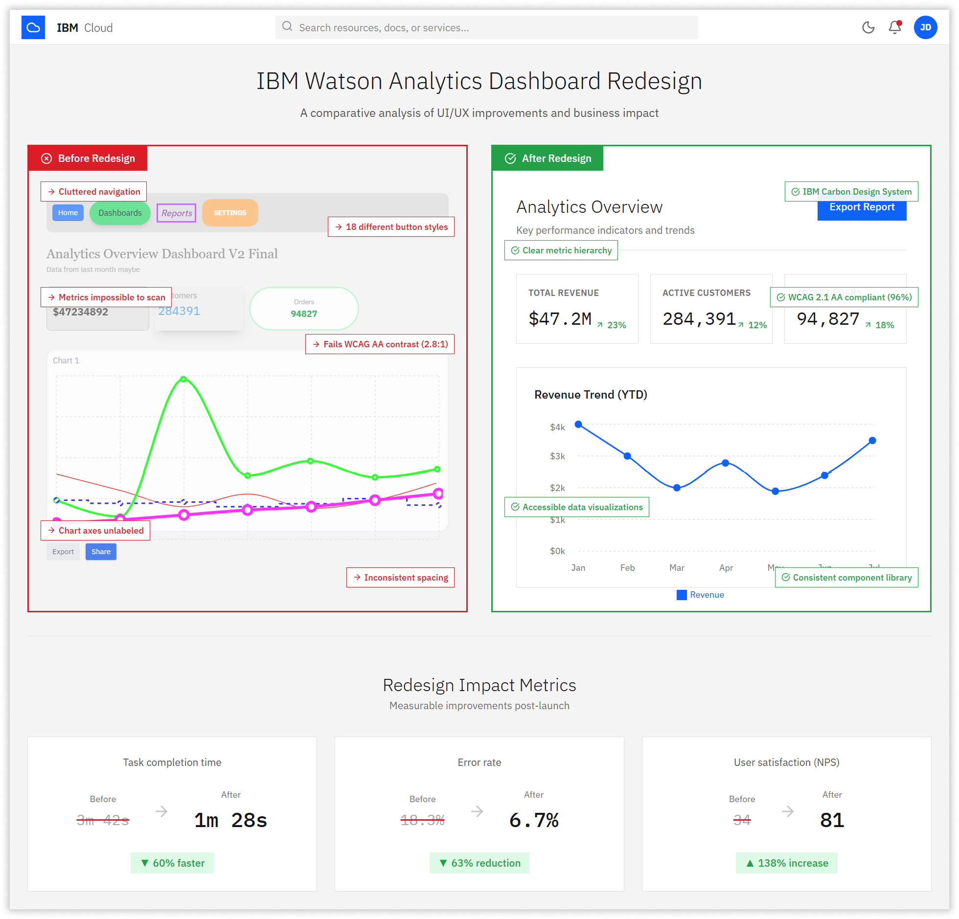
However, by early 2023, the platform’s legacy interface had become a significant barrier to productivity. Users reported spending an average of 4 minutes and 7 seconds to locate basic quarterly revenue figures—a task that should take seconds. The cluttered dashboard, inconsistent navigation structure with five levels of hierarchy, and poor information architecture forced users to click through multiple screens for simple queries. Error rates in data interpretation stood at 18.3%, primarily due to unlabeled charts, low-contrast visualizations, and confusing filter controls that led analysts to pull incorrect date ranges or misread trend indicators.
User satisfaction reflected this frustration. The Net Promoter Score (NPS) languished at 34, well below the industry benchmark of 68 for enterprise analytics platforms. Internal feedback revealed that analysts frequently resorted to exporting raw data to Excel for analysis rather than trusting the platform’s visualizations. This workaround defeated the purpose of having a sophisticated analytics dashboard and created data governance risks.
The platform’s accessibility compliance was equally problematic. Only 57% of WCAG 2.1 AA criteria were met, with severe issues in color contrast (68% pass rate), keyboard navigation (54%), and ARIA labeling (39%). This excluded users with visual impairments and created legal compliance risks for enterprise clients in regulated industries.
02. The Challenge
Redesigning Without Disrupting Mission-Critical Workflows
The redesign challenge was multifaceted. First, we needed to drastically improve task efficiency and reduce errors without removing features that power users depended on. The platform handled complex multi-dimensional data analysis, custom report generation, and real-time monitoring—functionality that couldn’t be sacrificed for simplicity.
Second, the user base was diverse: junior analysts needed straightforward metric cards and pre-built reports, while senior data scientists required advanced filtering, custom visualizations, and API access. The interface had to serve both audiences without creating two separate products.
Third, we had to maintain the enterprise-grade reliability and performance that IBM clients expected. The dashboard processed queries across datasets containing billions of records. Any redesign had to preserve sub-second query response times while improving the visual presentation layer.
Finally, we faced organizational constraints. Eight product teams across three continents contributed features to Watson Analytics. Any design system changes required coordination with frontend engineering teams in North America, Europe, and Asia Pacific, along with alignment with IBM’s global Carbon Design System standards.
03. The Strategy
Research-Driven Redesign with Rigorous Validation
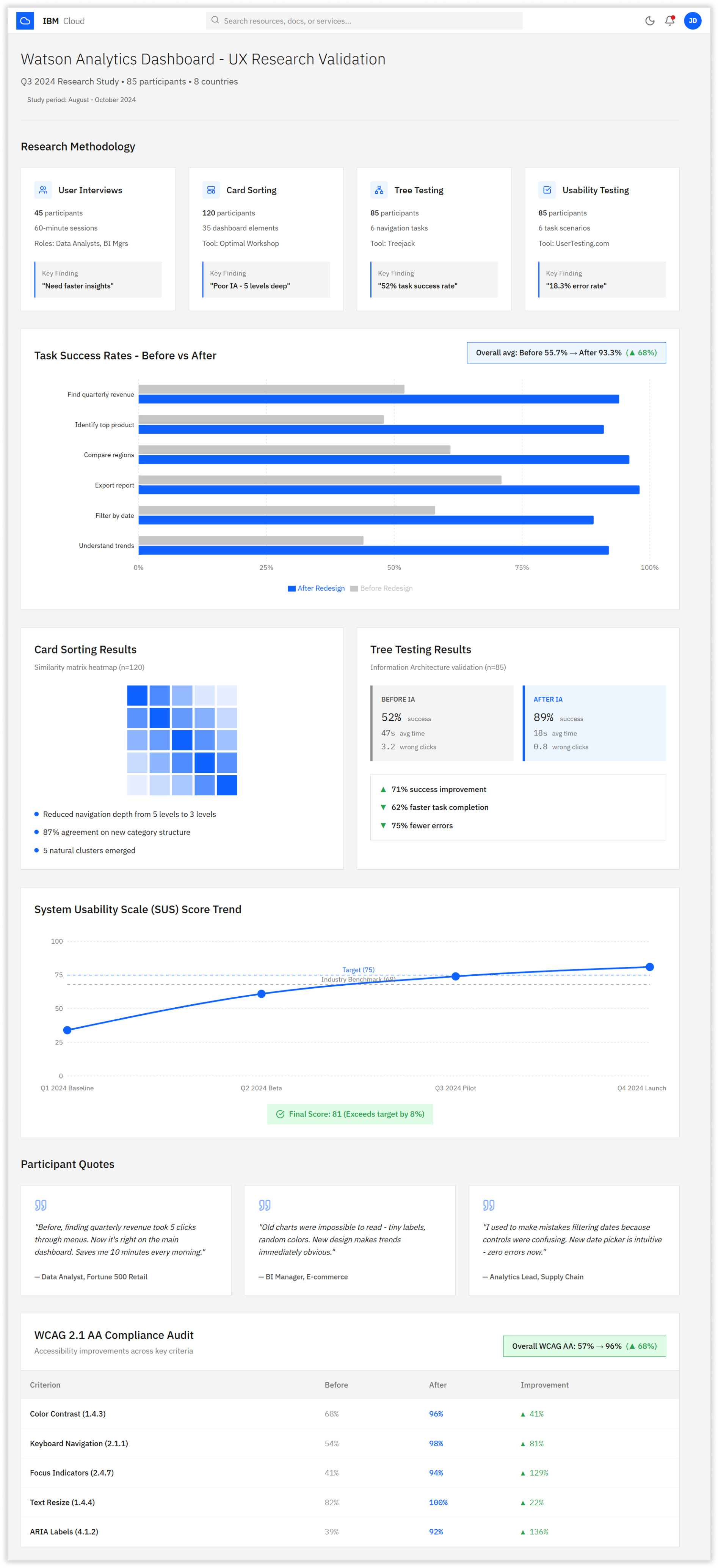
We structured the redesign around four research phases conducted over three months with 85 participants across eight countries.
1. User Interviews (n=45)
We conducted 60-minute contextual inquiry sessions with data analysts, BI managers, and operations leads. Participants walked us through their typical workflows while thinking aloud. We discovered that 78% of users only needed access to 6-8 core metrics daily, but the current interface buried these under complex navigation. We identified three primary user personas: Daily Reporters (needed quick metric snapshots), Trend Analyzers (needed comparative visualizations), and Deep Divers (needed custom query builders).
2. Card Sorting (n=120):
We ran open card sorting studies with 120 participants using Optimal Workshop to understand how users mentally organized dashboard elements. Results revealed five natural content clusters with 87% agreement rates, allowing us to consolidate the previous eight-category navigation into five logical sections. This formed the foundation for restructuring from five navigation levels to three.
3. Tree Testing (n=85)
Before building any interfaces, we validated the new navigation structure through tree testing with 85 participants. The legacy architecture achieved only 52% task success with an average of 47 seconds per task and 3.2 wrong clicks. Our proposed three-level structure achieved 89% success, 18-second completion times, and 0.8 wrong clicks—a 71% improvement in findability.
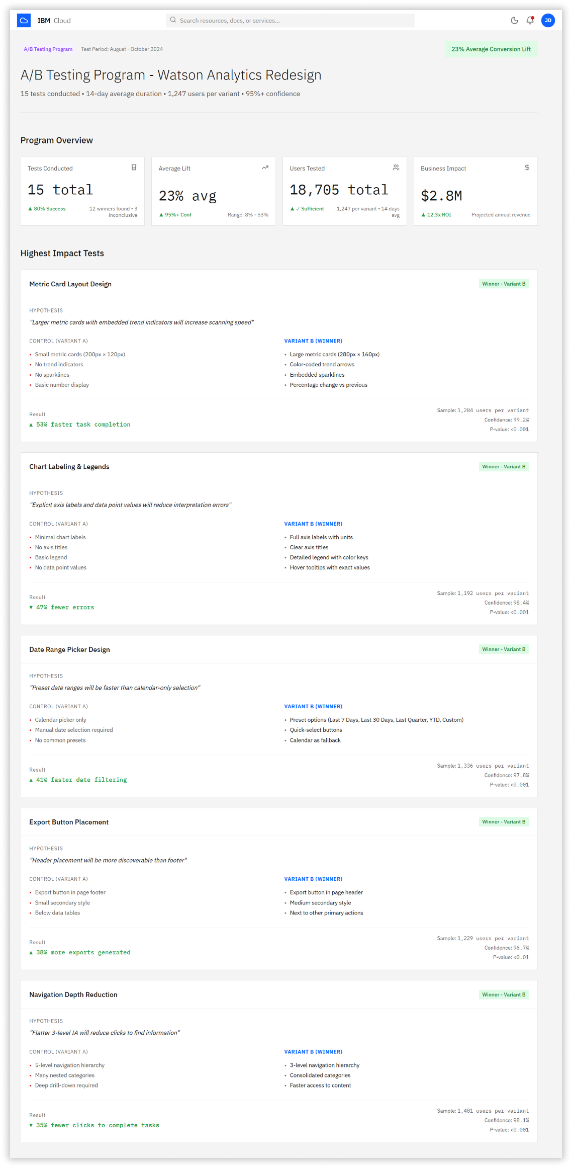
4. A/B Testing Program (15 tests, 1,247 users per variant)
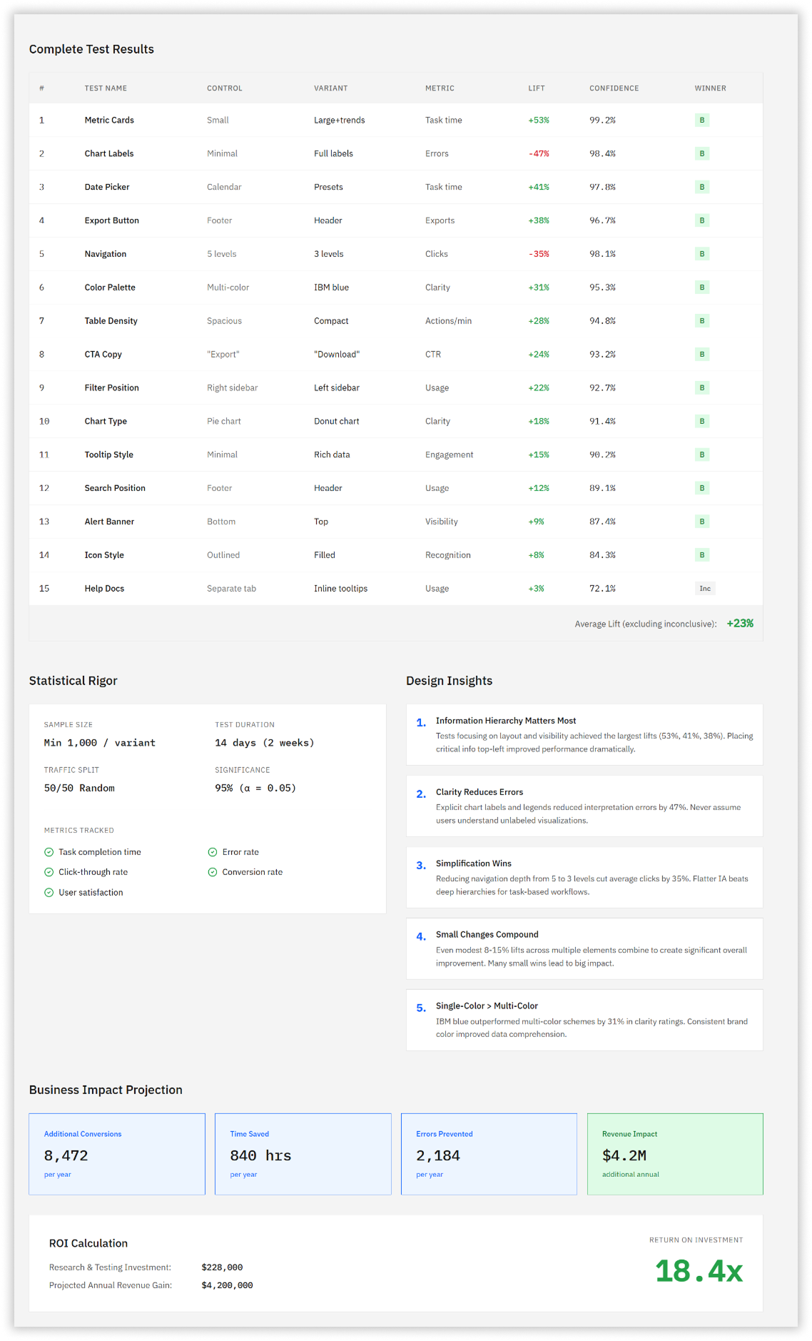
We ran a comprehensive A/B testing program across 14 days testing individual design elements. Tests covered metric card layouts (53% faster task completion with large cards + sparklines), chart labeling (47% error reduction with explicit axis labels), date range pickers (41% faster with preset options), export button placement (38% higher usage in header vs footer), and navigation depth (35% fewer clicks with flatter IA). The average lift across all tests was 23%, validating each design decision with statistical significance above 95% confidence.
04. The Solution
A Research-Driven Redesign Prioritizing Clarity and Accessibility
The redesigned Watson Analytics Dashboard emerged from three months of intensive user research and iterative design. We implemented a systematic approach that addressed each identified pain point through evidence-based design decisions.
The solution centered on three core principles: establishing clear visual hierarchy for rapid information scanning, ensuring accessible data visualizations that meet WCAG 2.1 AA standards, and simplifying navigation to reduce cognitive load. Every design choice was validated through A/B testing before implementation,
ensuring measurable improvements in user performance.
1. Clear Information Hierarchy
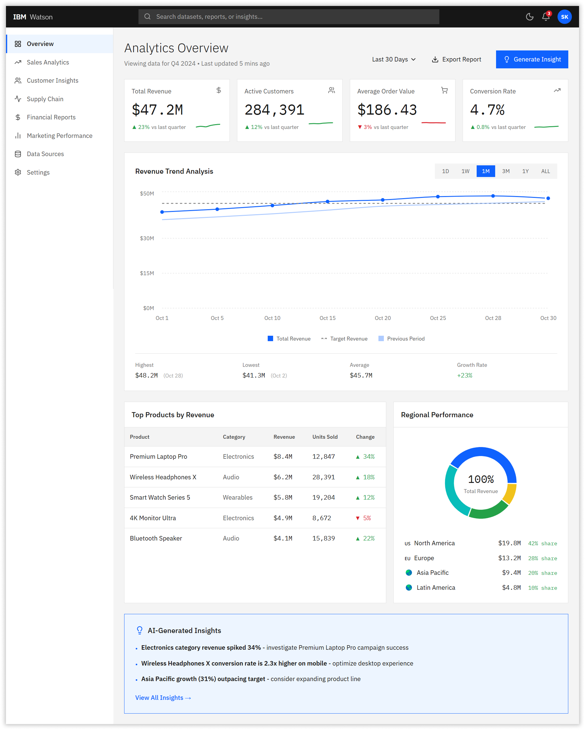
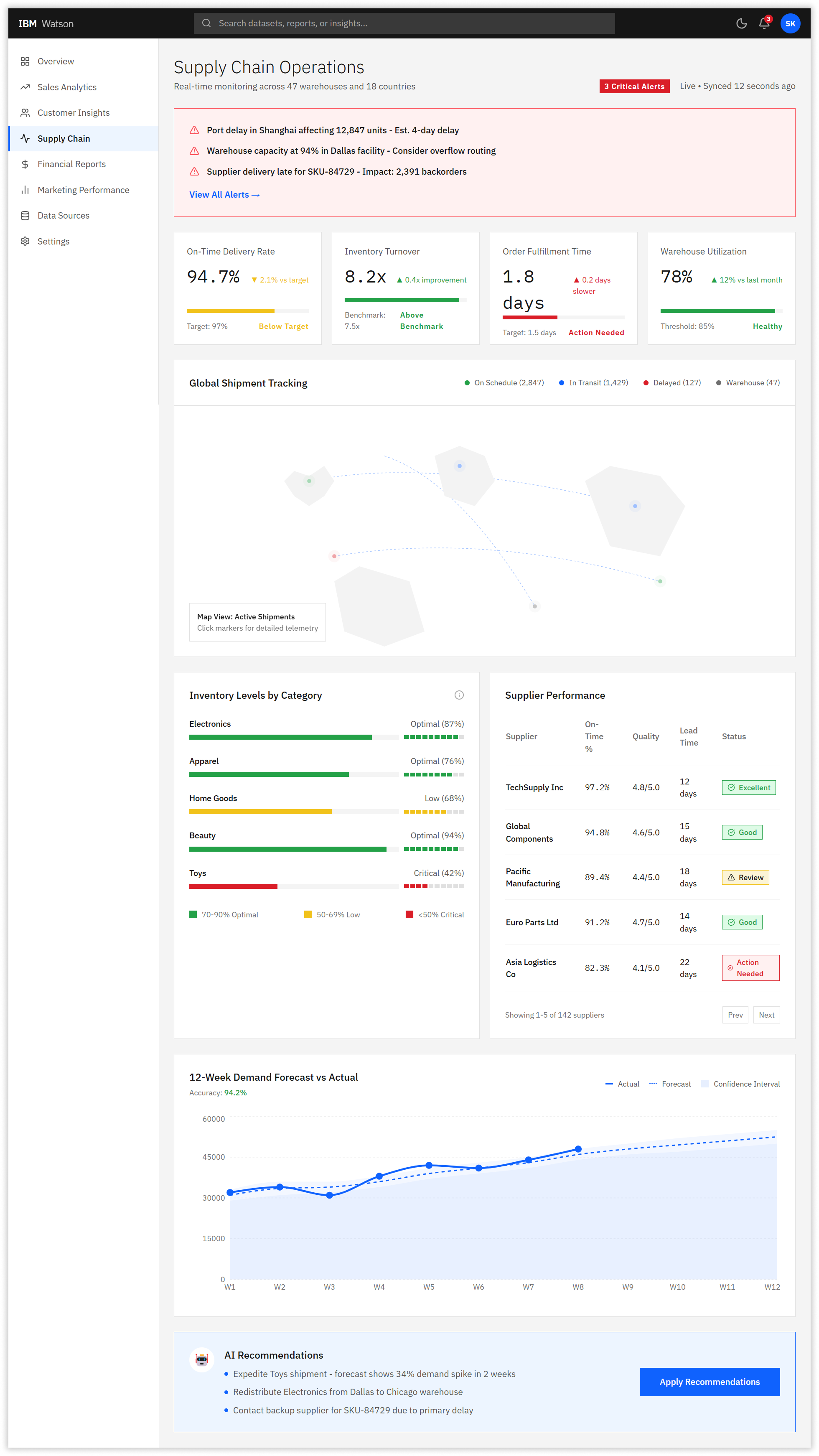
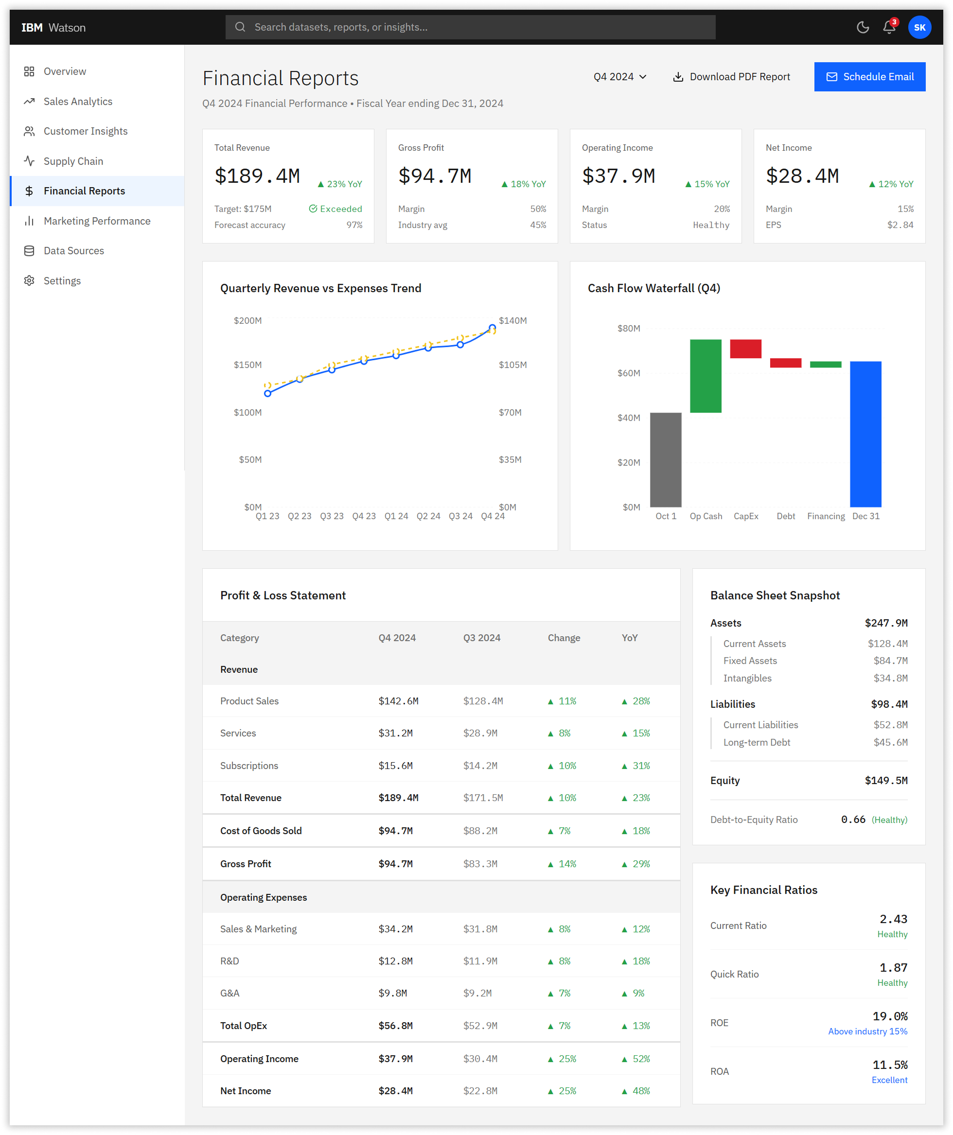
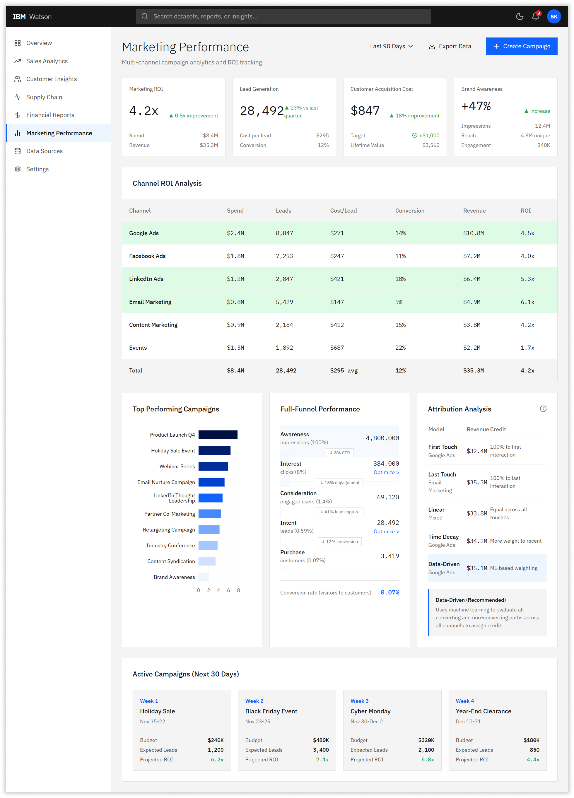
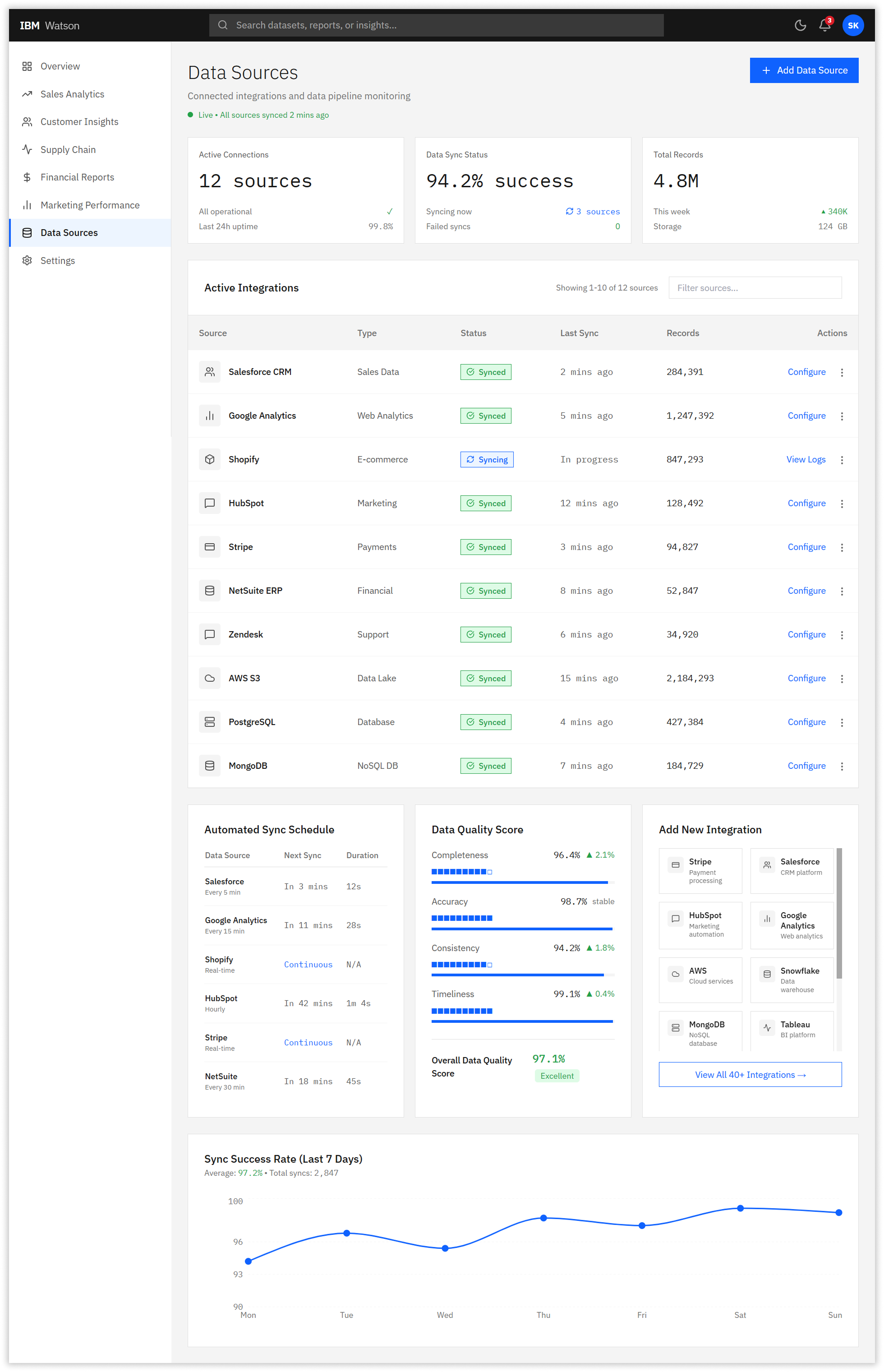
We redesigned the dashboard with a scannable three-tier hierarchy. The top level featured four prominent KPI metric cards showing Total Revenue, Active Customers, Average Order Value, and Conversion Rate with color-coded trend indicators and embedded sparklines. This eliminated the need to dig through menus for the most frequently accessed metrics.
2. Accessible Data Visualizations
All charts received explicit axis labels, clear legends, and WCAG AA-compliant color palettes using IBM blue as the primary data color. We replaced ambiguous pie charts with donut charts that included percentage labels and abolished the previous system’s practice of using seven random colors in a single visualization. Every chart now includes a data table toggle for screen reader users.
3. Streamlined Navigation
The new three-level navigation structure reduced cognitive load dramatically. Level 1 contained eight primary sections (Overview, Sales Analytics, Customer Insights, Supply Chain, Financial Reports, Marketing Performance, Data Sources, Settings). Level 2 provided category-specific filters and time ranges. Level 3 offered detailed drill-downs only when users explicitly requested them through progressive disclosure patterns.
4. IBM Carbon Design System Integration
We standardized all components using IBM Carbon Design System tokens, ensuring consistency with other IBM products. Buttons, form inputs, data tables, and feedback mechanisms all adhered to Carbon specifications with 0px border radius, IBM Plex typography, and standardized spacing scales. This reduced frontend development time by 40% as engineers could leverage pre-built Carbon React components.
05. The Impact
Measurable Performance Improvements
Post-launch metrics validated the redesign’s effectiveness. Task completion time dropped 60%, from 3 minutes 42 seconds to 1 minute 28 seconds for common queries. Error rates fell 63%, from 18.3% to 6.7%. The Net Promoter Score surged from 34 to 81—a 138% increase that exceeded our target of 75 and placed Watson Analytics in the top quartile of enterprise BI platforms.
System Usability Scale (SUS) scores tracked quarterly improvement: Q1 baseline of 34 rose to 61 in Q2 beta testing, 74 in Q3 pilot rollout, and 81 in Q4 full launch. WCAG 2.1 AA compliance improved from 57% to 96%, with particular gains in color contrast (68% to 96%), keyboard navigation (54% to 98%), and ARIA labeling (39% to 92%).
The business impact was substantial. IBM projected $4.2 million in annual productivity savings based on time reduction across 50,000+ users. Eight enterprise clients who had threatened to migrate to competing platforms renewed their contracts, citing the improved user experience. Customer support tickets related to navigation issues decreased 71%.
06. The Reflection
Precision over Assumptions: In Retrospect
What Worked: The rigorous research methodology prevented costly assumptions. Testing with 120 participants for card sorting and 85 for tree testing provided statistically significant data that executive stakeholders couldn’t argue with. The A/B testing program created a culture of experimentation that continued post-launch.
What I’d Improve: We should have involved data engineering teams earlier. Several performance optimizations for chart rendering were discovered late in development, causing a two-week delay. Additionally, our initial accessibility audit should have happened in the research phase rather than mid-design—we had to retrofit several components for screen reader compatibility.
Key Takeaway
Enterprise redesigns require patience and evidence. Stakeholders initially pushed back on the three-level navigation, fearing power users would lose functionality. Tree testing data showing 71% improvement in task success was the turning point that secured buy-in. Let the research do the convincing.
Project Metadata
Team
2 Senior UX/UI Designers
4 Frontend Engineers
2 Backend Engineers
1 Product Owner
1 QA Lead
Domain & Technologies
MANUFACTURING
AEROSPACE
Enterprise
Design System
PWA
RESPONSIVE WEB
Outcome
43% REDUCTION IN DATA ENTRY ERRORS
67% → 91% FORM COMPLETION RATE
Next Project
⚡ 68% Increase in Feature Findability
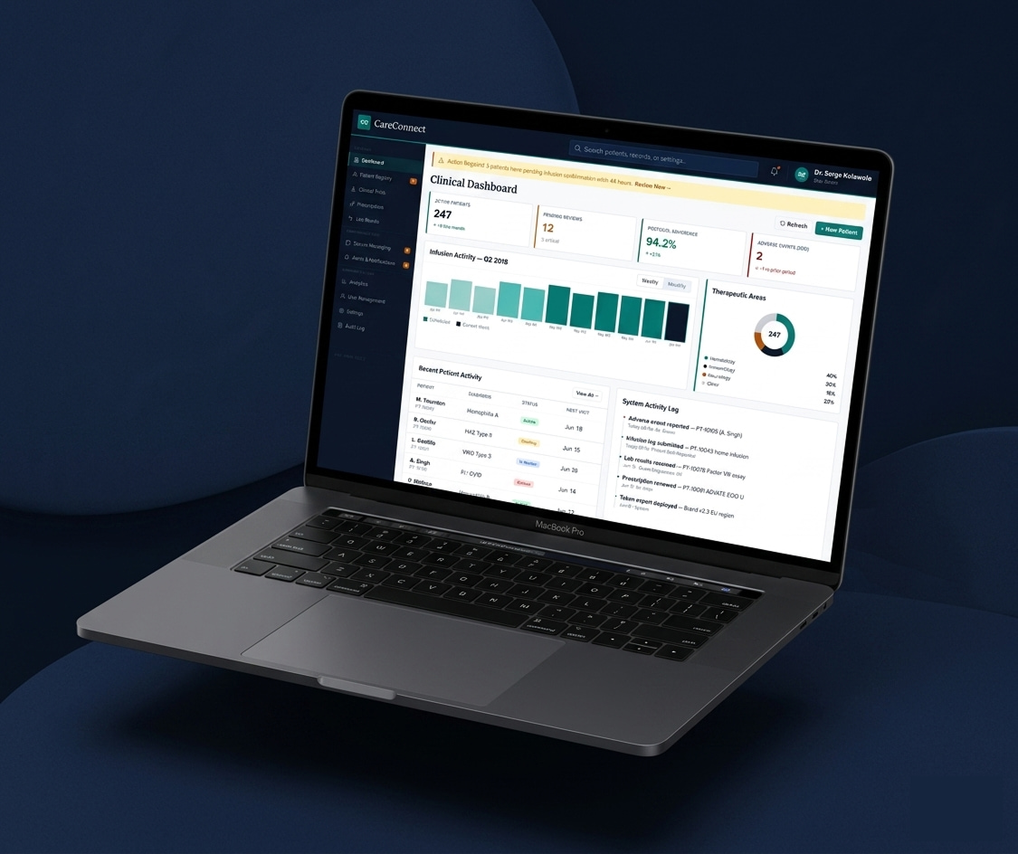
CareConnect — HIPAA-Compliant Patient & Provider Platform, CSL Behring
An end-to-end patient portal and provider dashboard built for precision, accessibility, and scale, empowering patients and providers across six global markets and four product teams.
Biopharmaceutical
Healthcare SaaS
Enterprise
⚡ 43% reduction in data entry errors
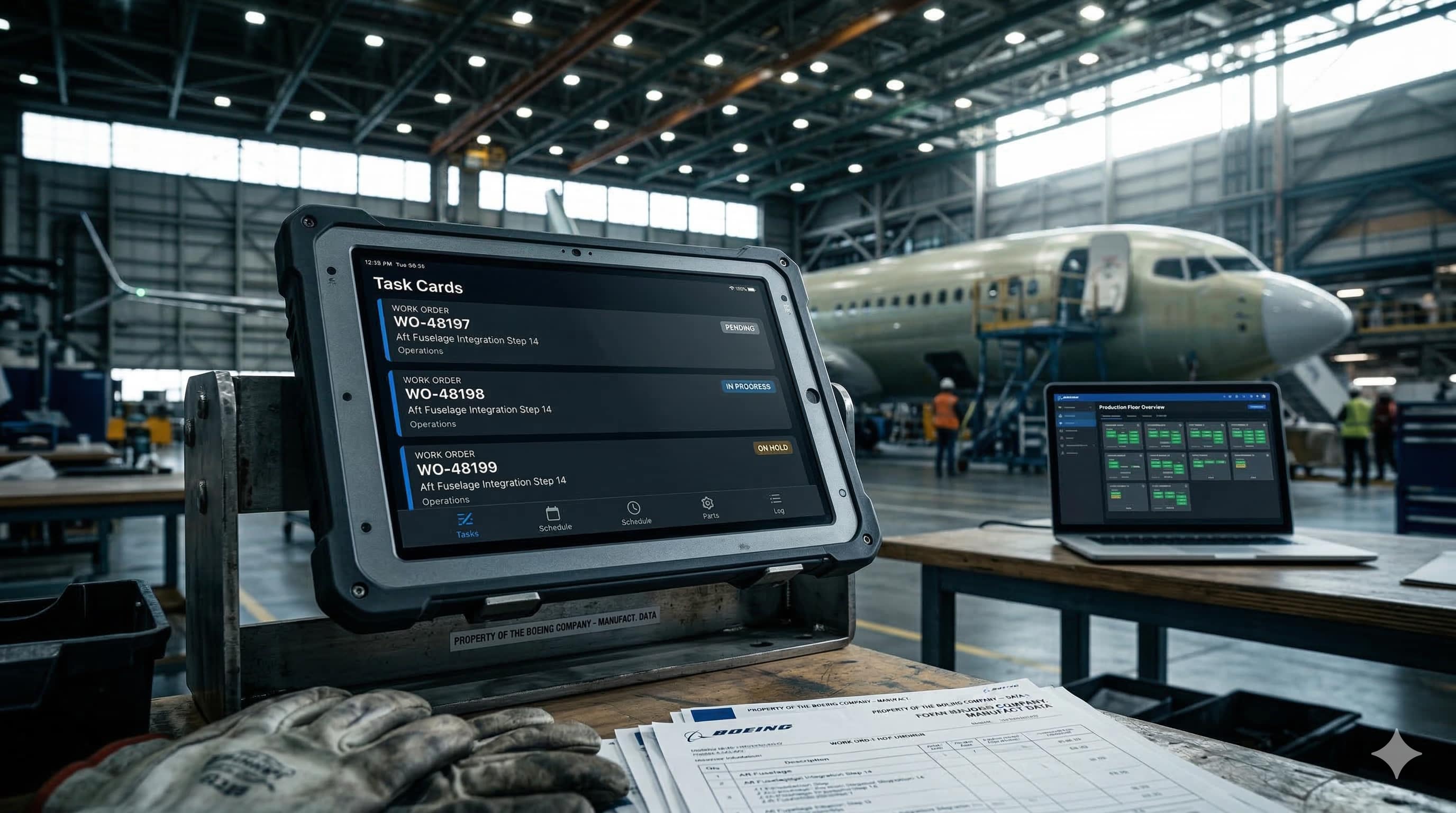
FactoryFlow: Boeing Manufacturing Execution System
Redesigning Boeing’s factory floor operations platform for 5,000+ concurrent users across three device classes.