Senior UI/UX Designer | May 2017 – July 2018
01. The Context
CSL Behring is one of the world’s leading biopharmaceutical companies, specialising in rare and serious diseases including haemophilia, hereditary angioedema, and primary immunodeficiency. The platform — CareConnect — was built to serve a uniquely high-stakes population: patients who self-administer intravenous infusions at home, track complex laboratory values, and depend on uninterrupted access to their care team for clinical guidance that directly affects their health outcomes.
The platform needed to serve two radically different user types simultaneously. On one side: patients like Marcus, a 67-year-old with rare haemophilia who accesses the portal monthly and struggles with medical jargon; and Sarah, a 34-year-old managing biologic injections who needs to know her infusion is confirmed before she can relax. On the other: Dr. James, a hematologist who reviews patient data multiple times daily and cannot afford to spend more time clicking through charts than talking to patients. These eight distinct personas — across patients, caregivers, specialists, nurses, pharmacists, and research coordinators — shared a single platform and demanded coherent design thinking across all of them.
02. The Challenge
The existing system was fragmented, inaccessible, and navigated by instinct rather than design. Usability testing revealed a System Usability Scale score of just 58 — below the industry benchmark of 68.
The information architecture alone required five levels of navigation to reach a blood test result. A patient needed 4.7 clicks on average simply to find their most recent haemoglobin reading. The form abandonment rate was critically high, and a low-vision user in testing could not read dosage information at the default font size. Every one of these failures had a human cost that went beyond inconvenience.
The design challenge was therefore threefold:
03. The Strategy
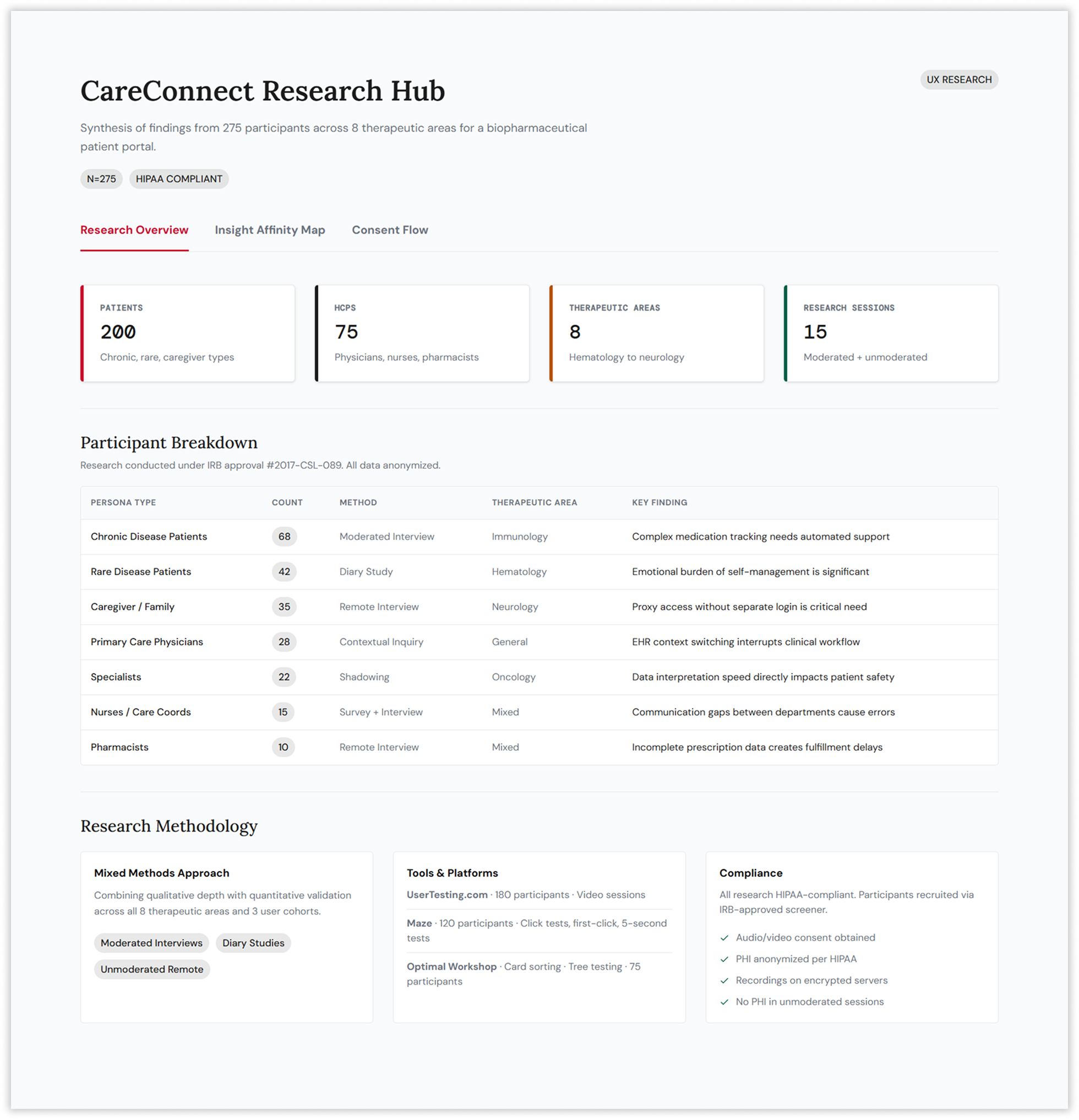
Starting With 275 People, Not Assumptions
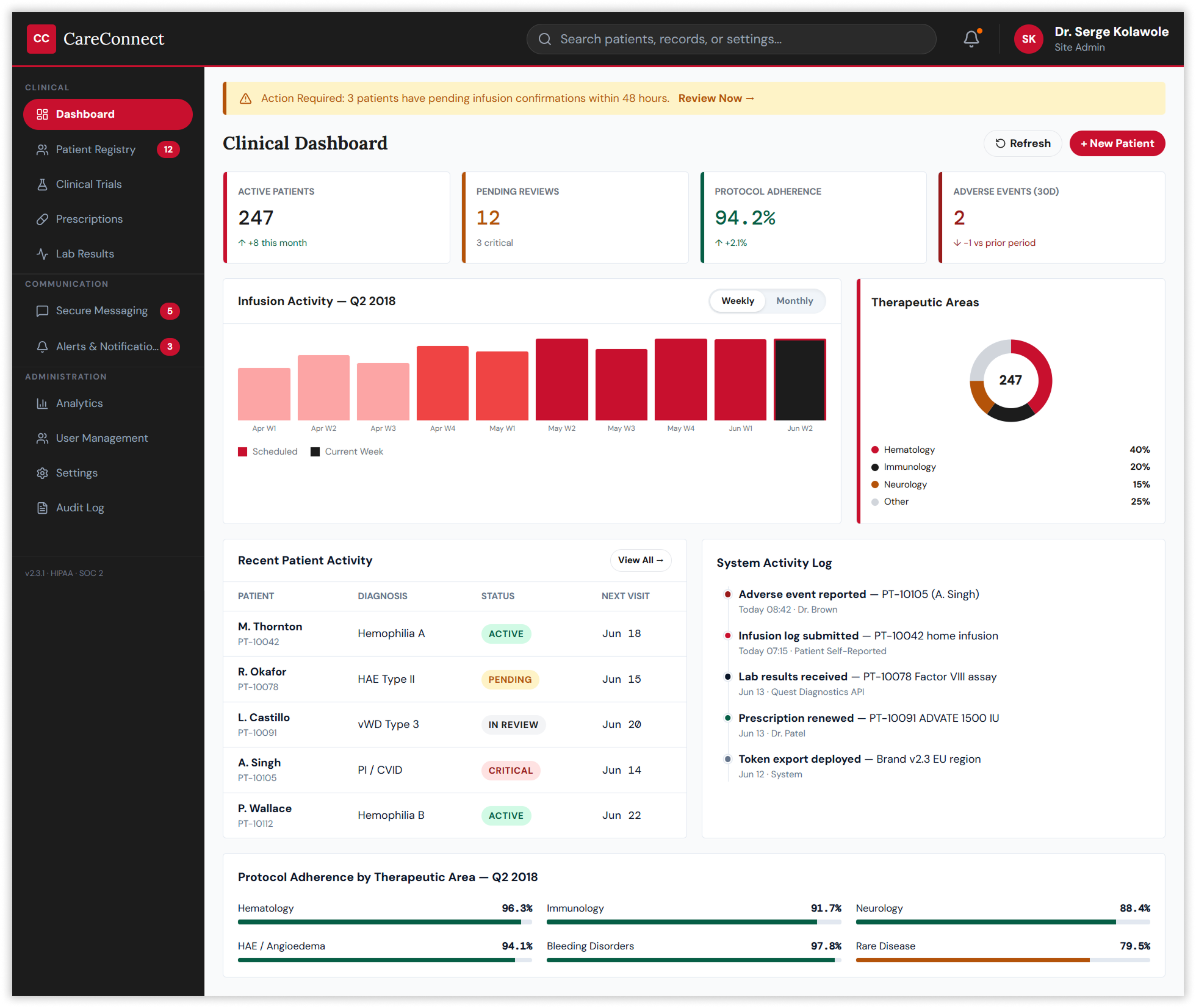
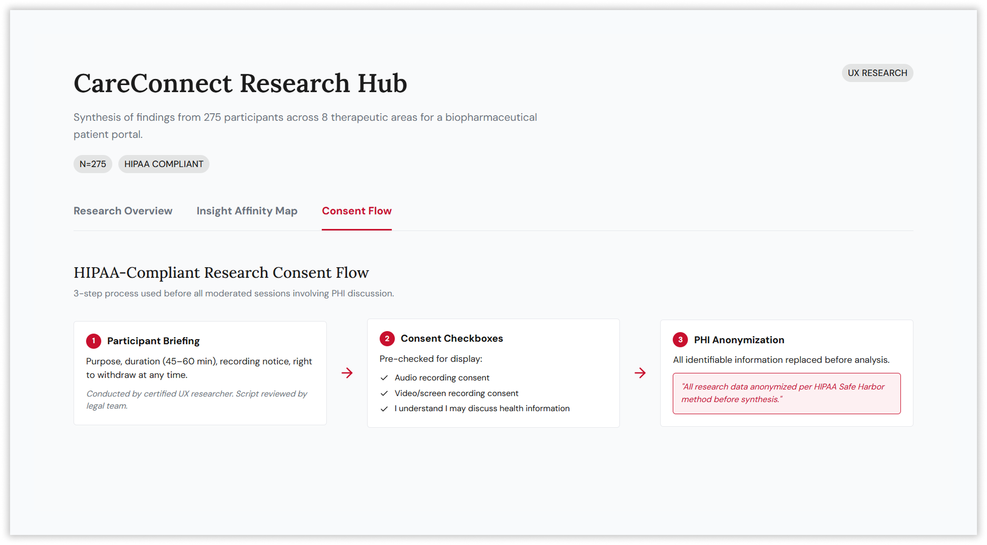
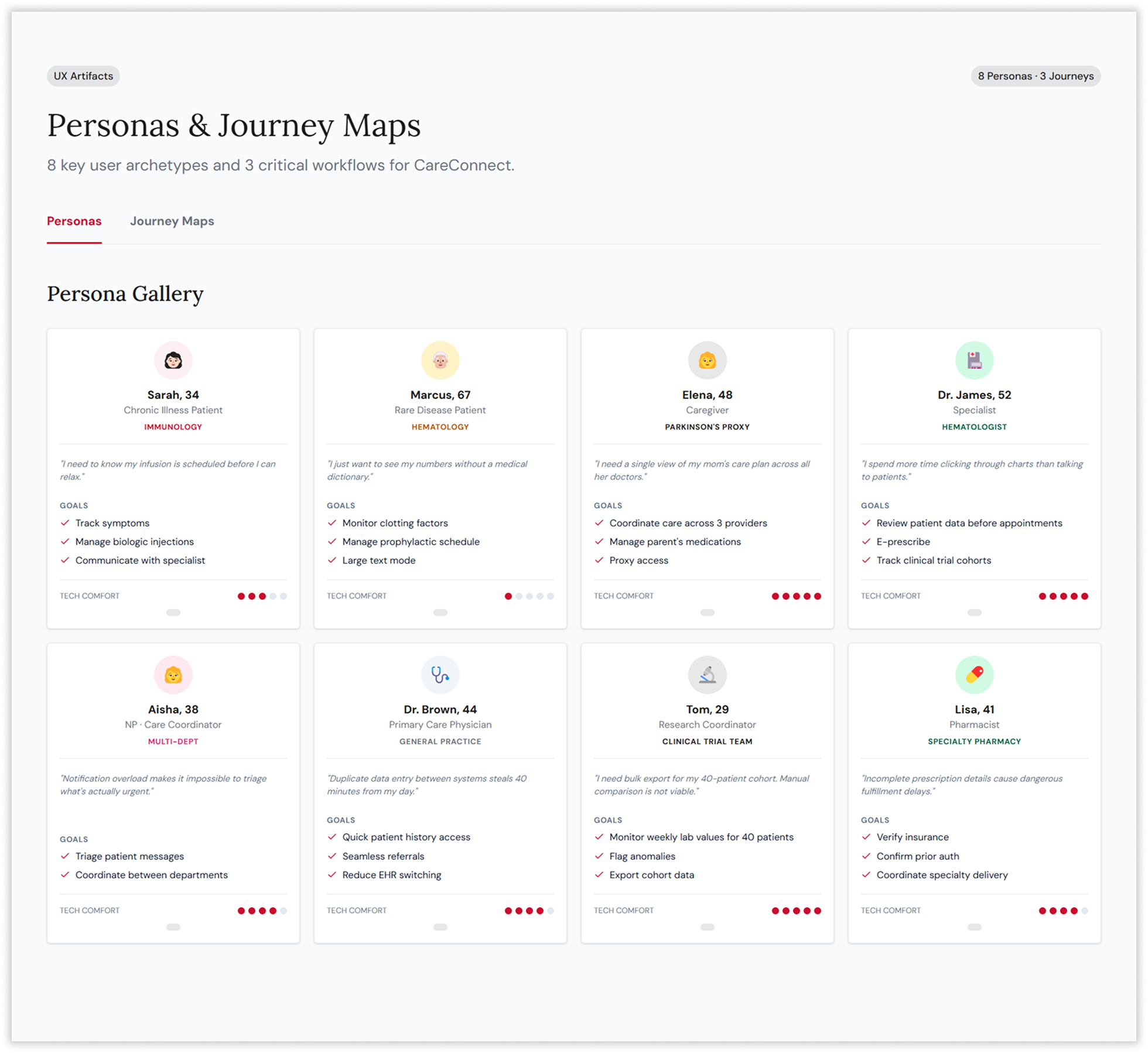
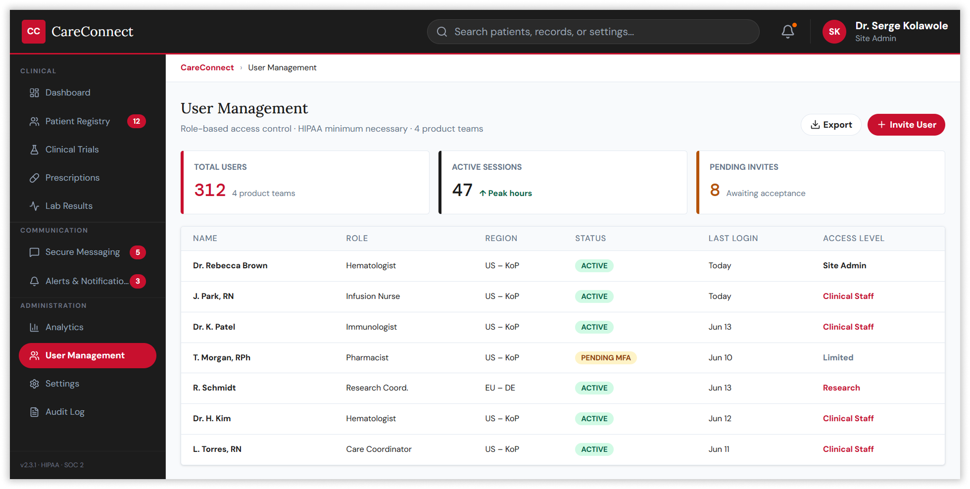
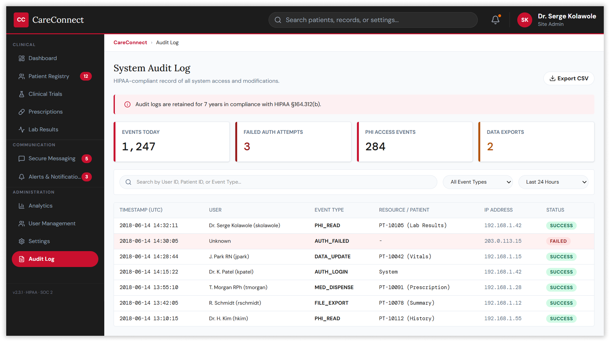
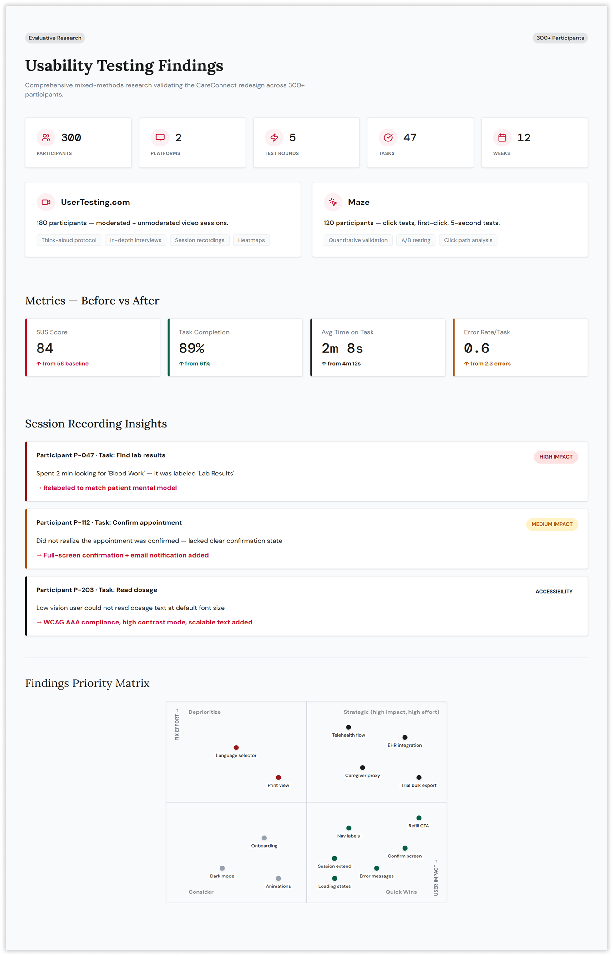
The strategy began with a comprehensive research programme spanning 200 patients and 75 healthcare professionals across eight therapeutic areas. Conducted under IRB approval and HIPAA Safe Harbor compliance, the research combined moderated interviews, diary studies, contextual inquiry, and remote unmoderated sessions to map the full landscape of user needs. Participants included chronic disease patients, rare disease patients, caregivers managing proxy access, primary care physicians frustrated by duplicate data entry, specialists demanding faster clinical data access, and research coordinators needing bulk export tools for 40-patient trial cohorts.
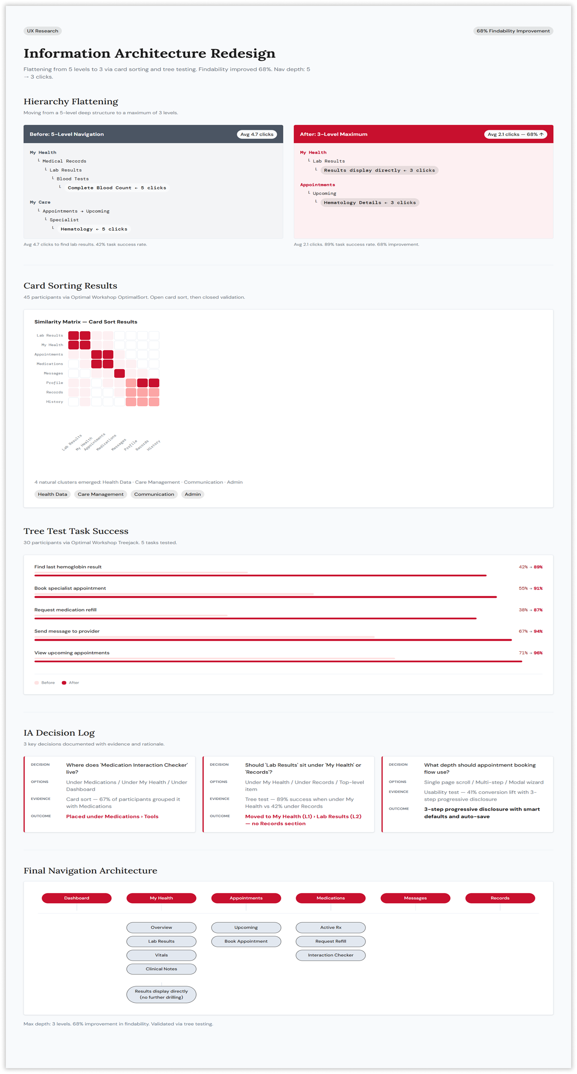
Making the Invisible Architecture Visible
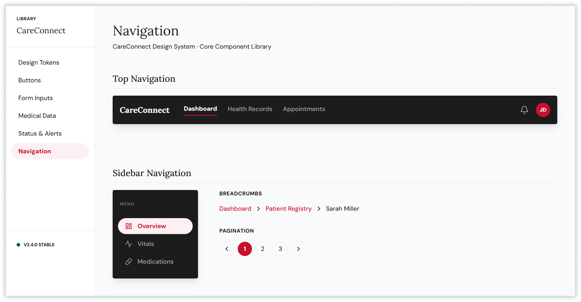
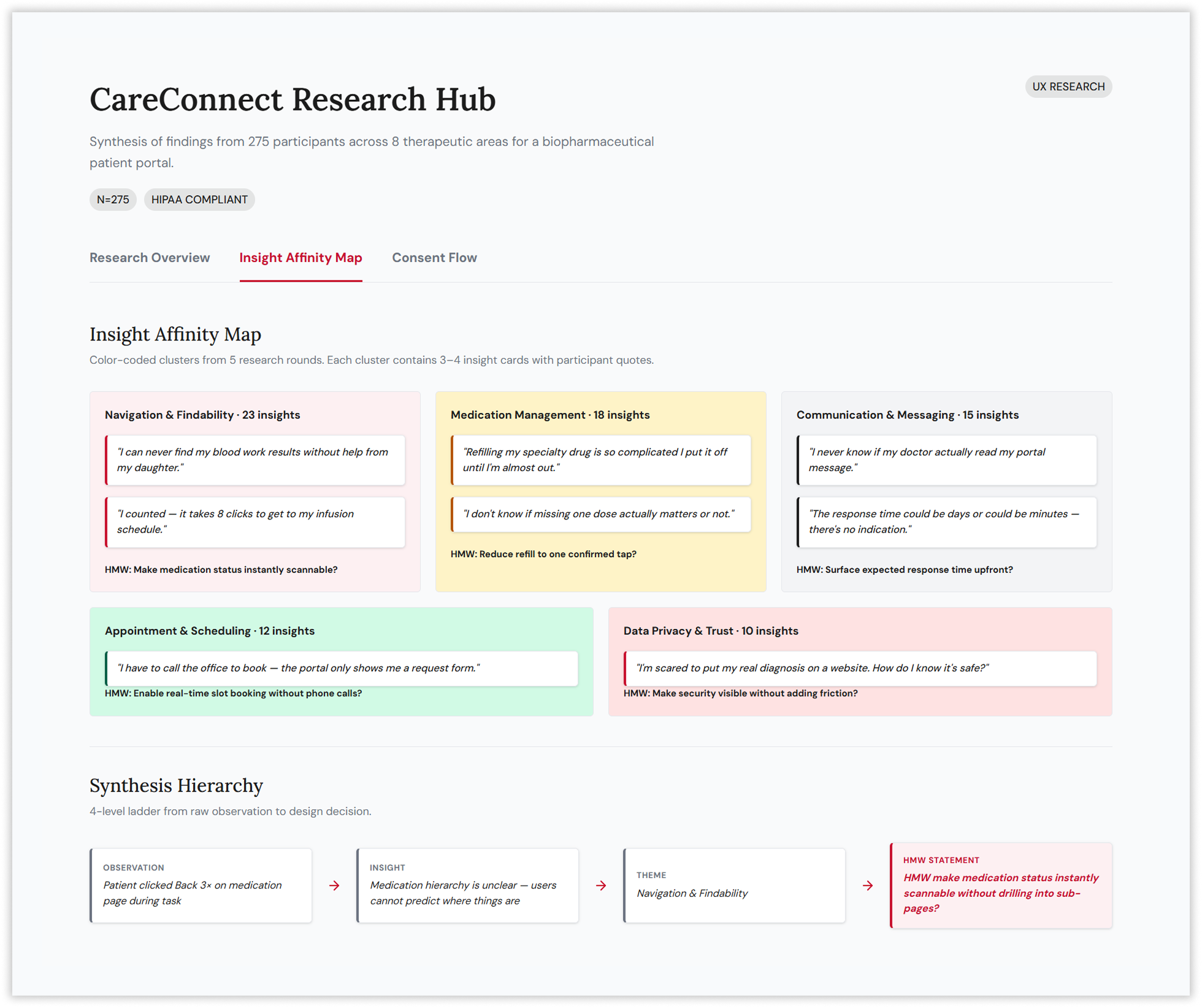
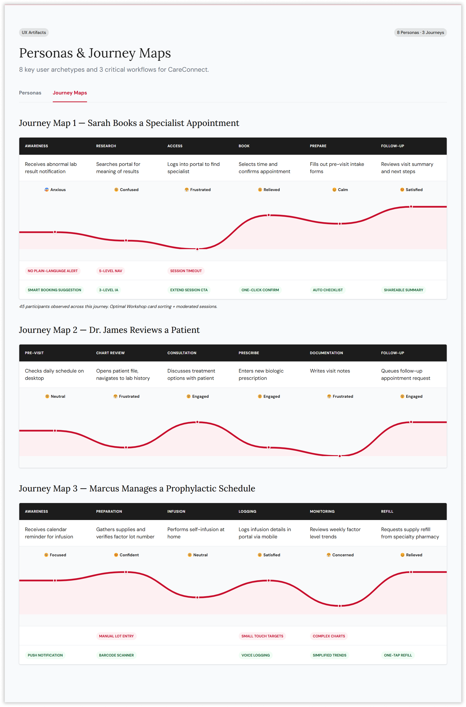
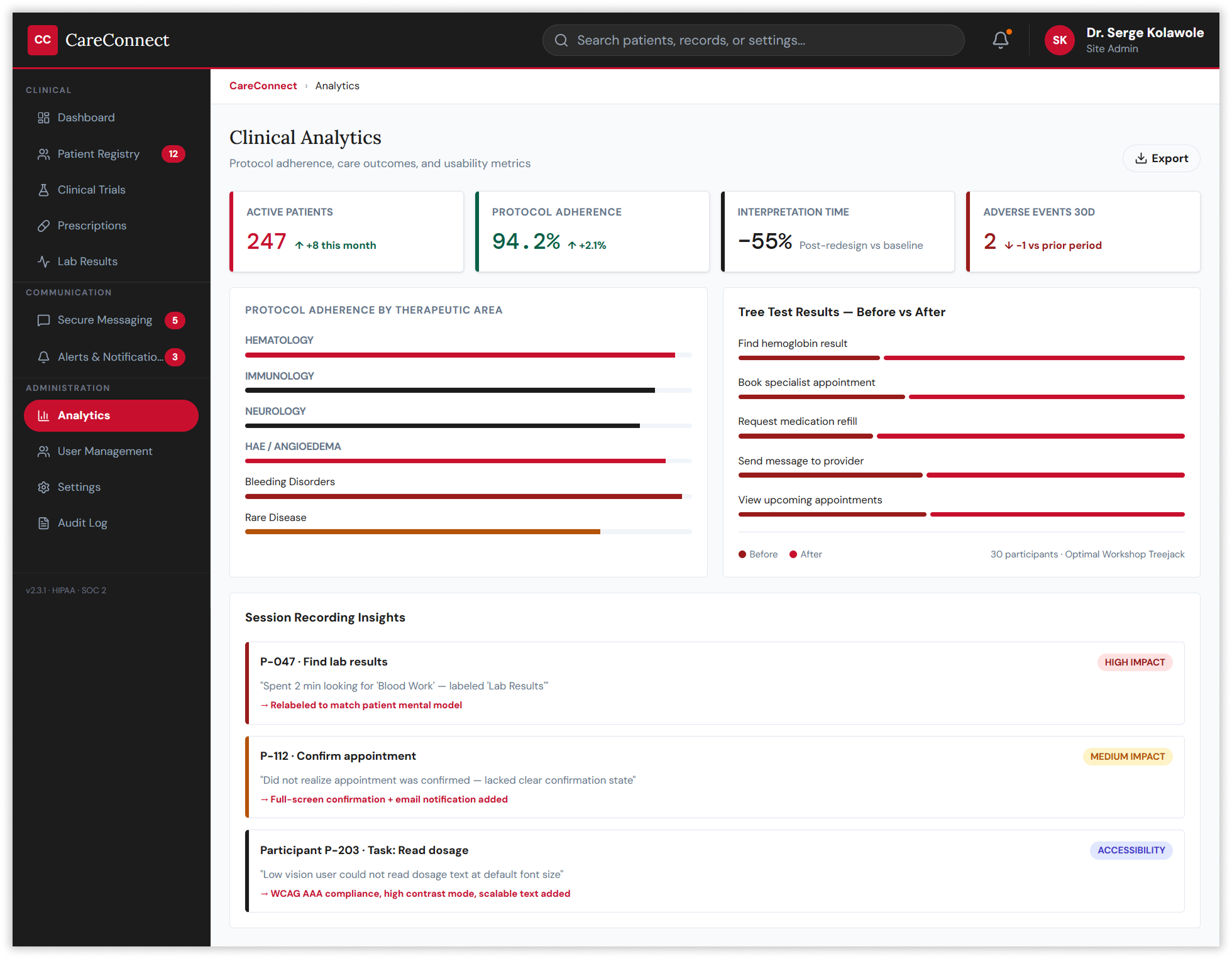
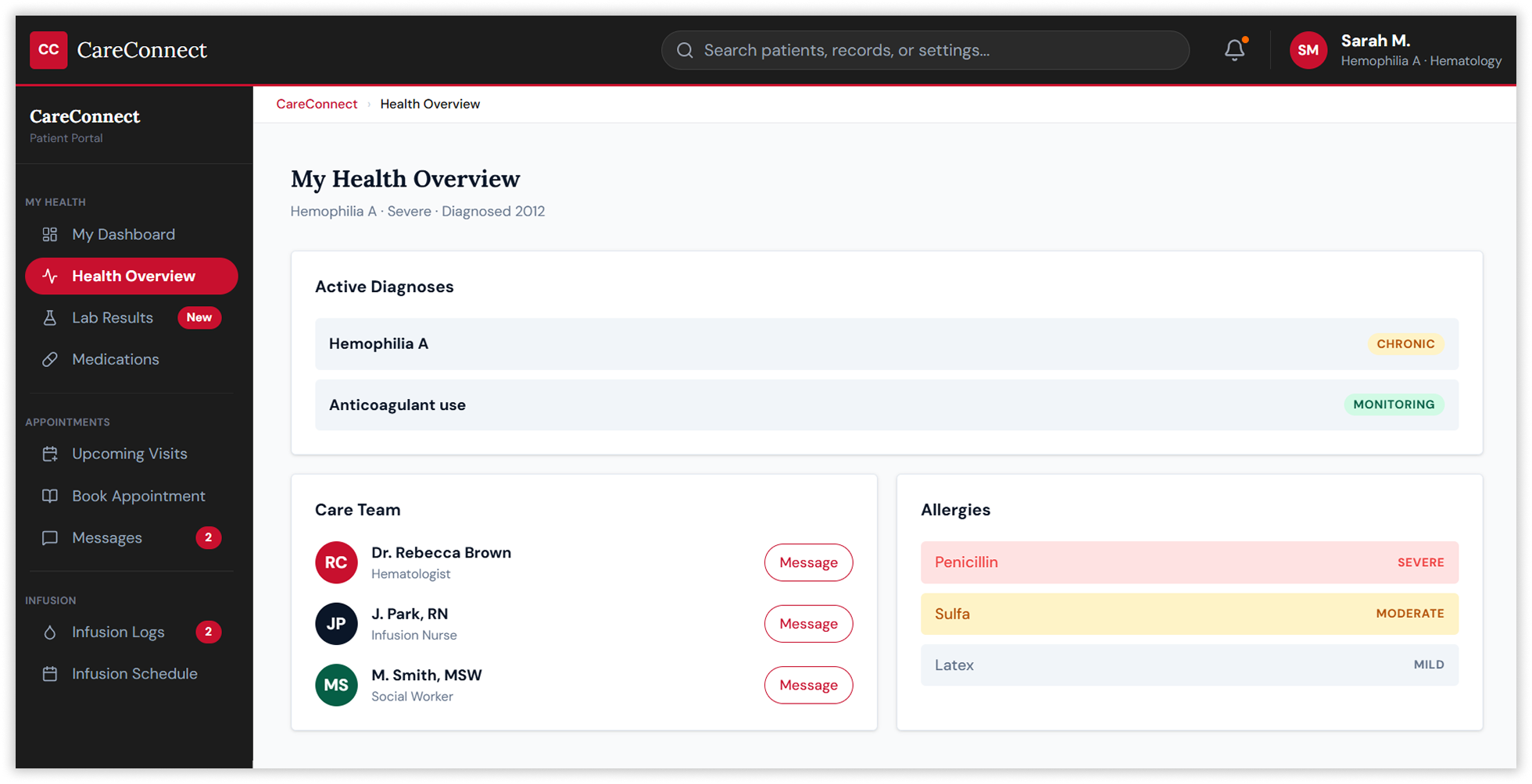
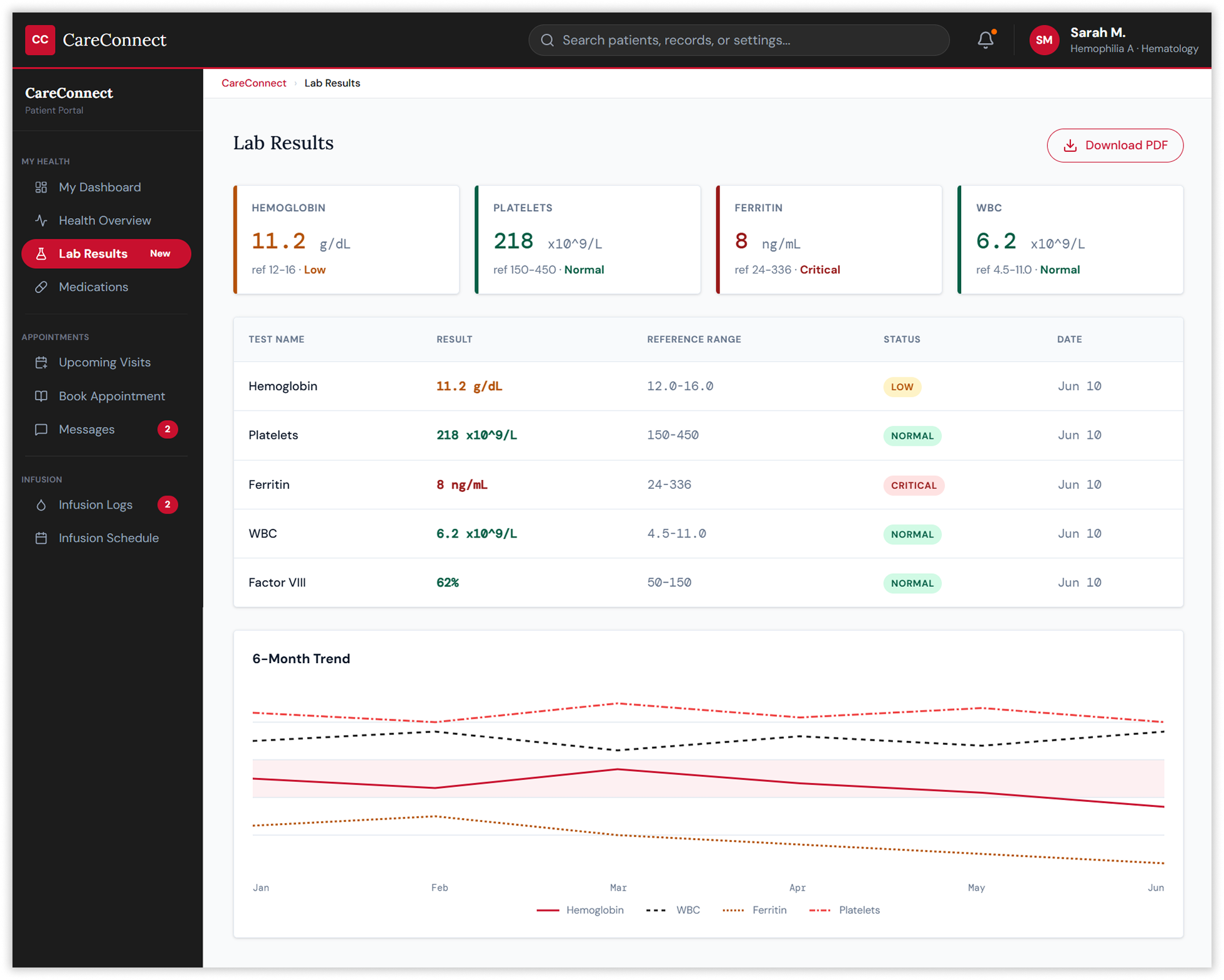
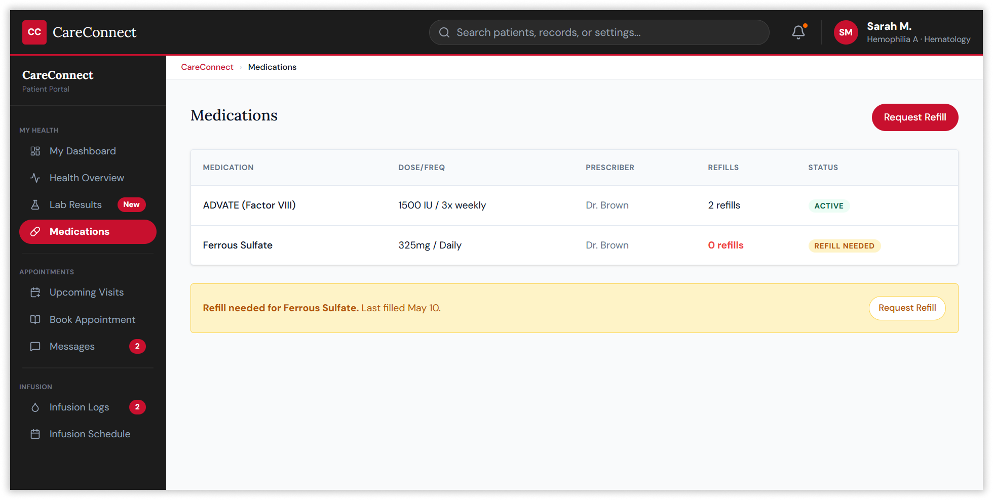
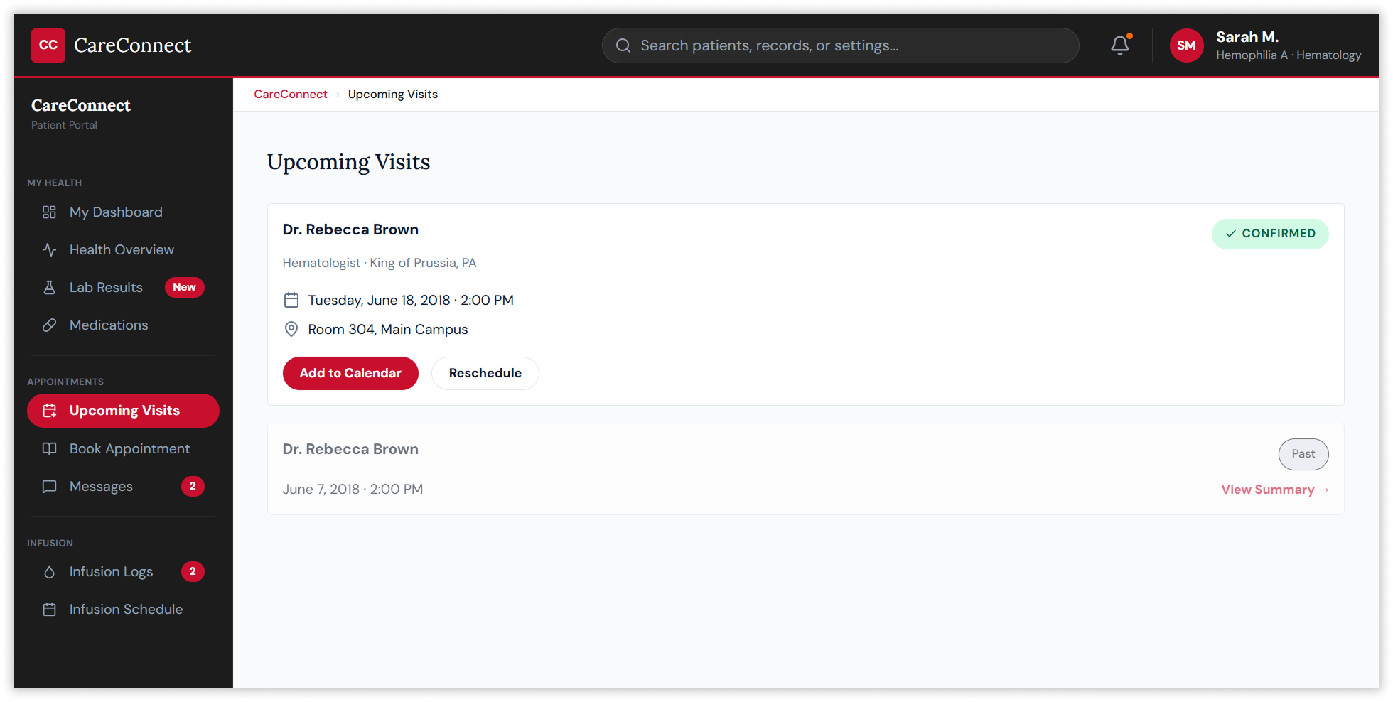
Card sorting and tree testing via Optimal Workshop with 75 participants revealed four natural information clusters — Health Data, Care Management, Communication, and Administration — that became the structural backbone of the redesigned navigation. The old five-level hierarchy was collapsed to a maximum of three, guided entirely by evidence from where users actually looked for things rather than how the system had historically organised them.
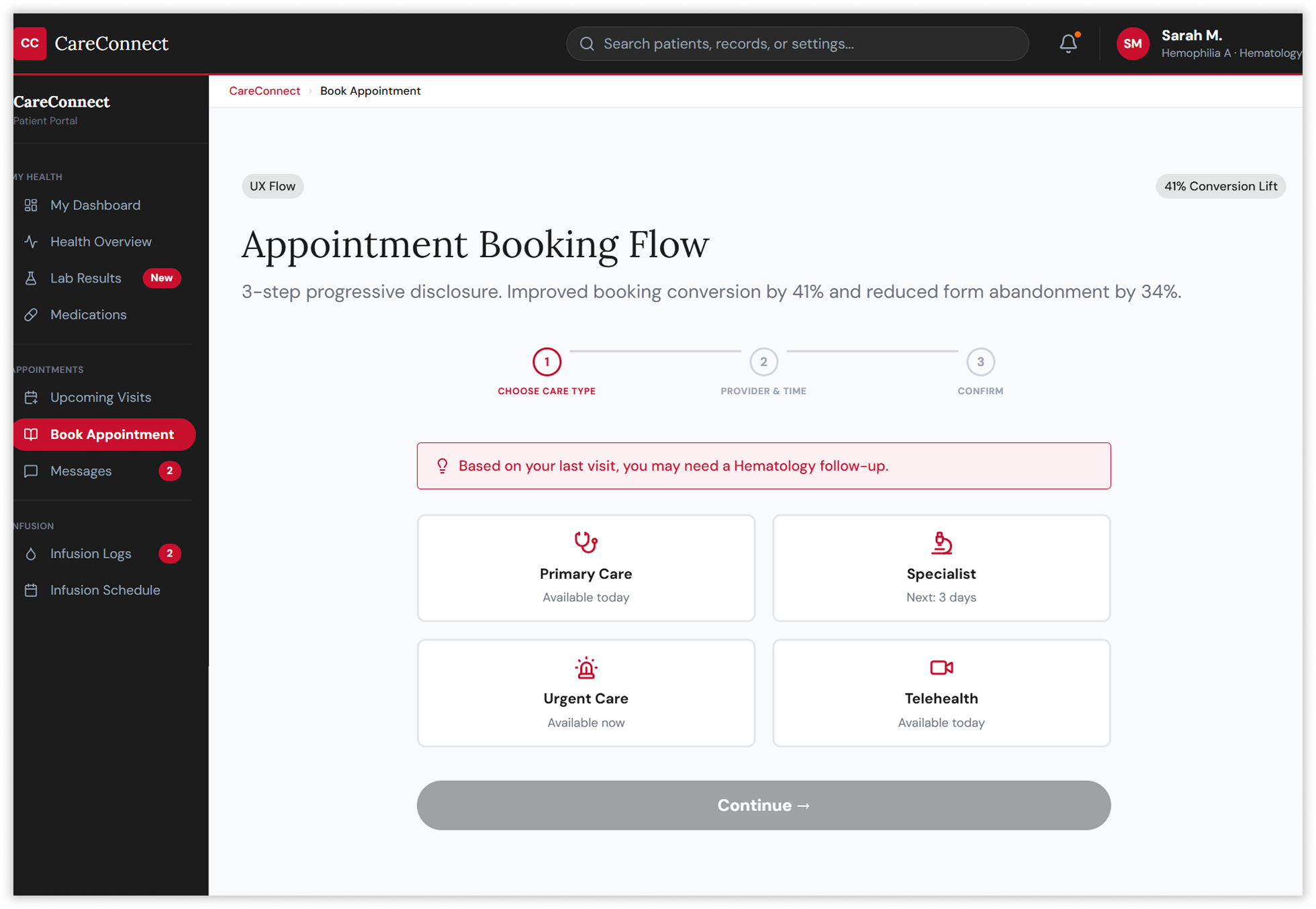
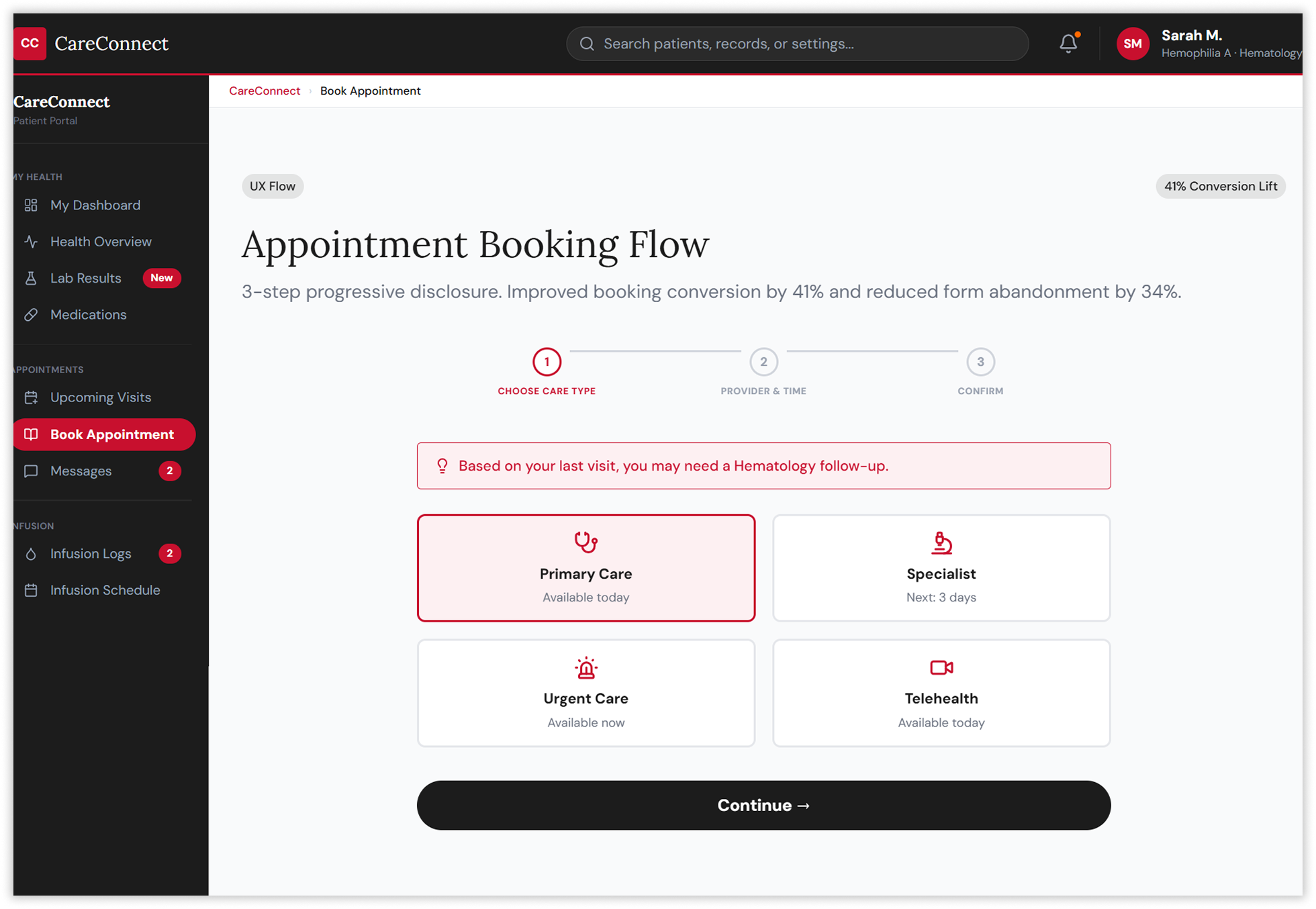
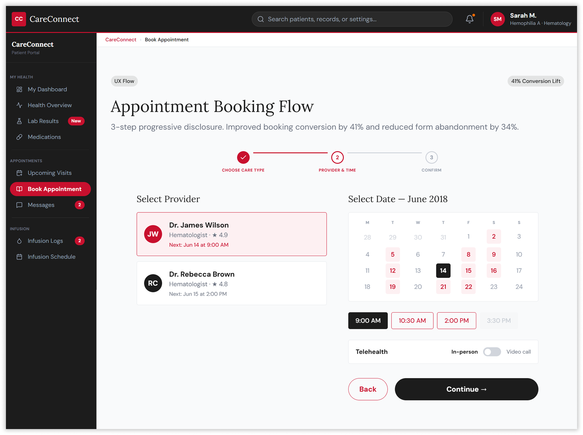
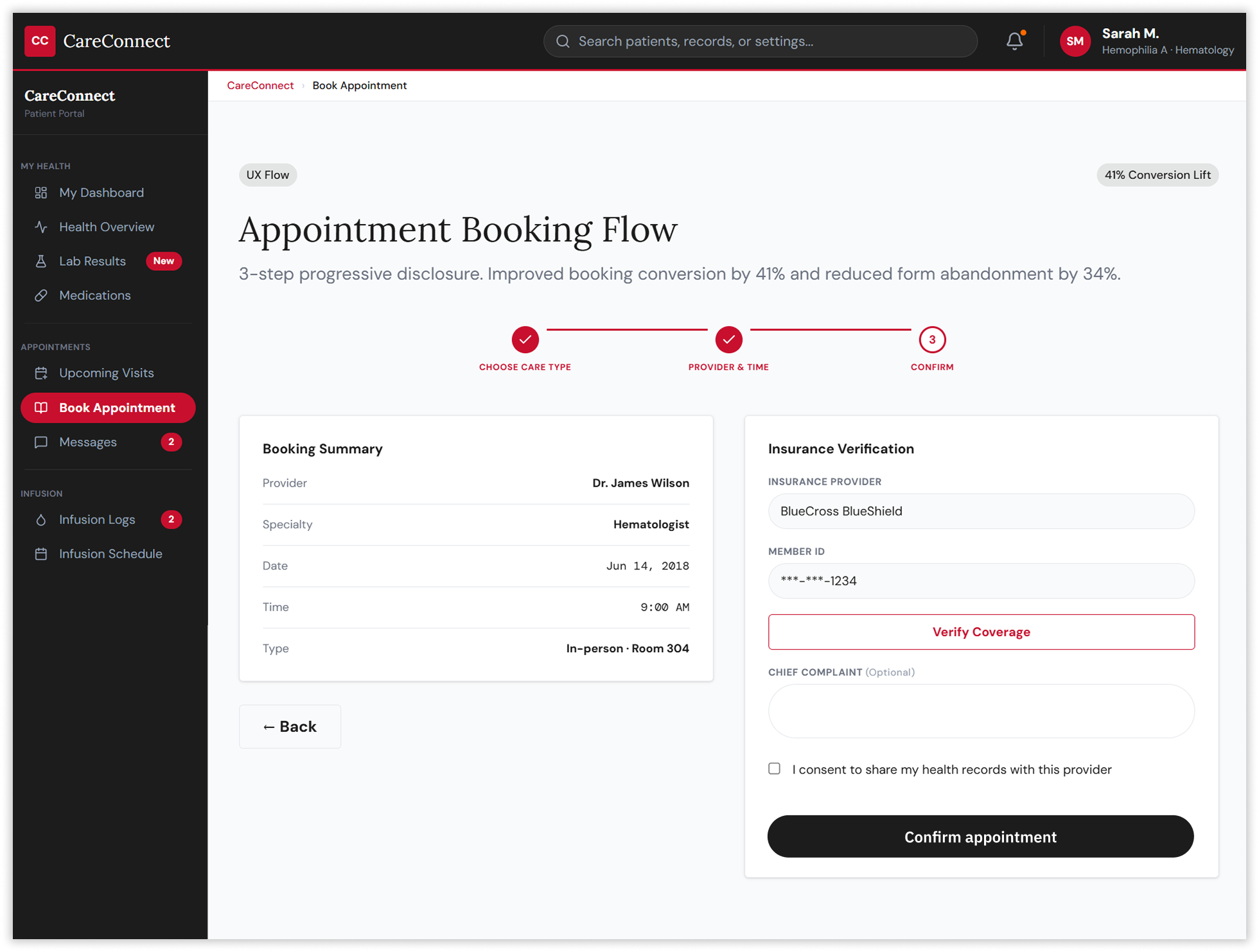
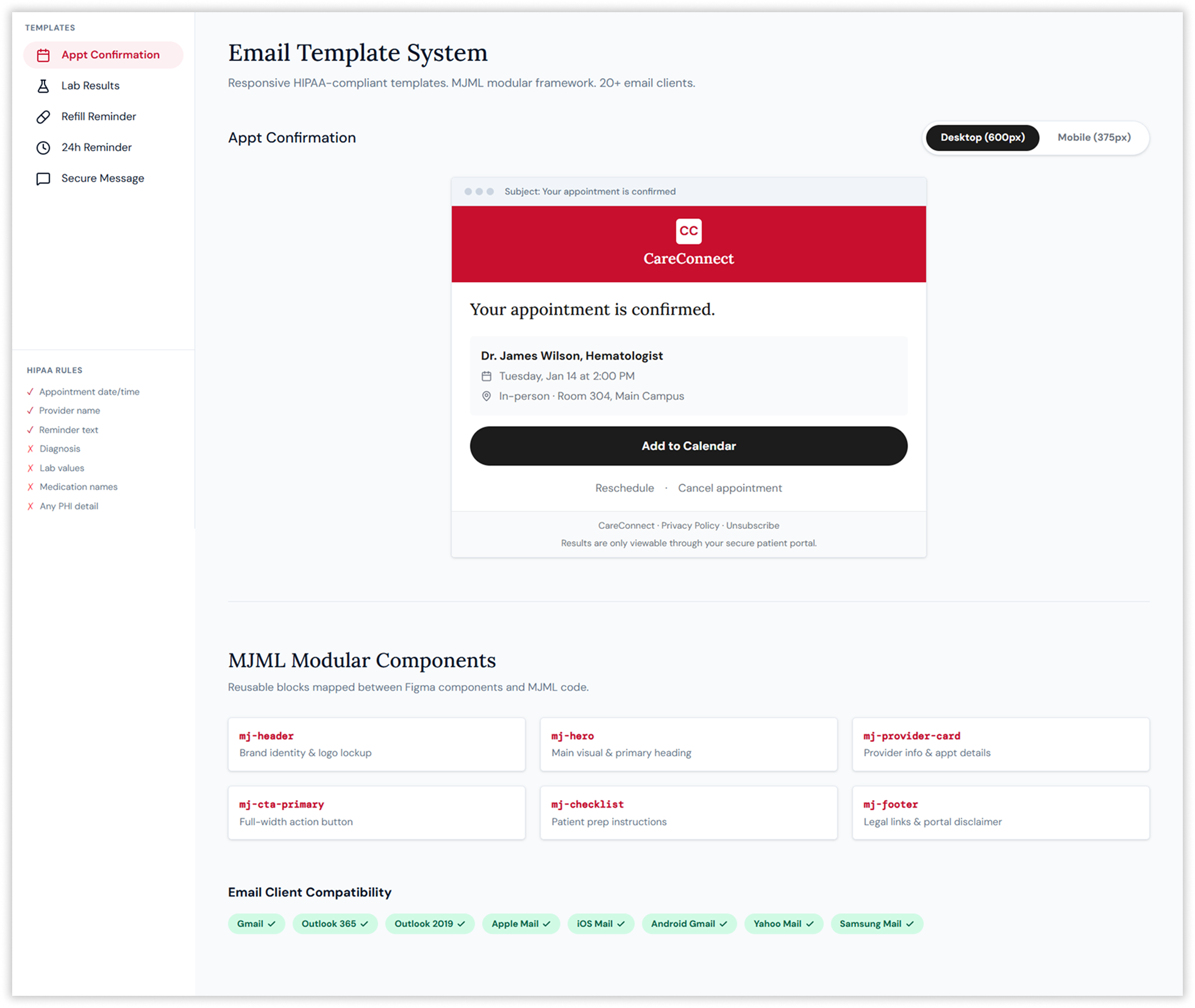
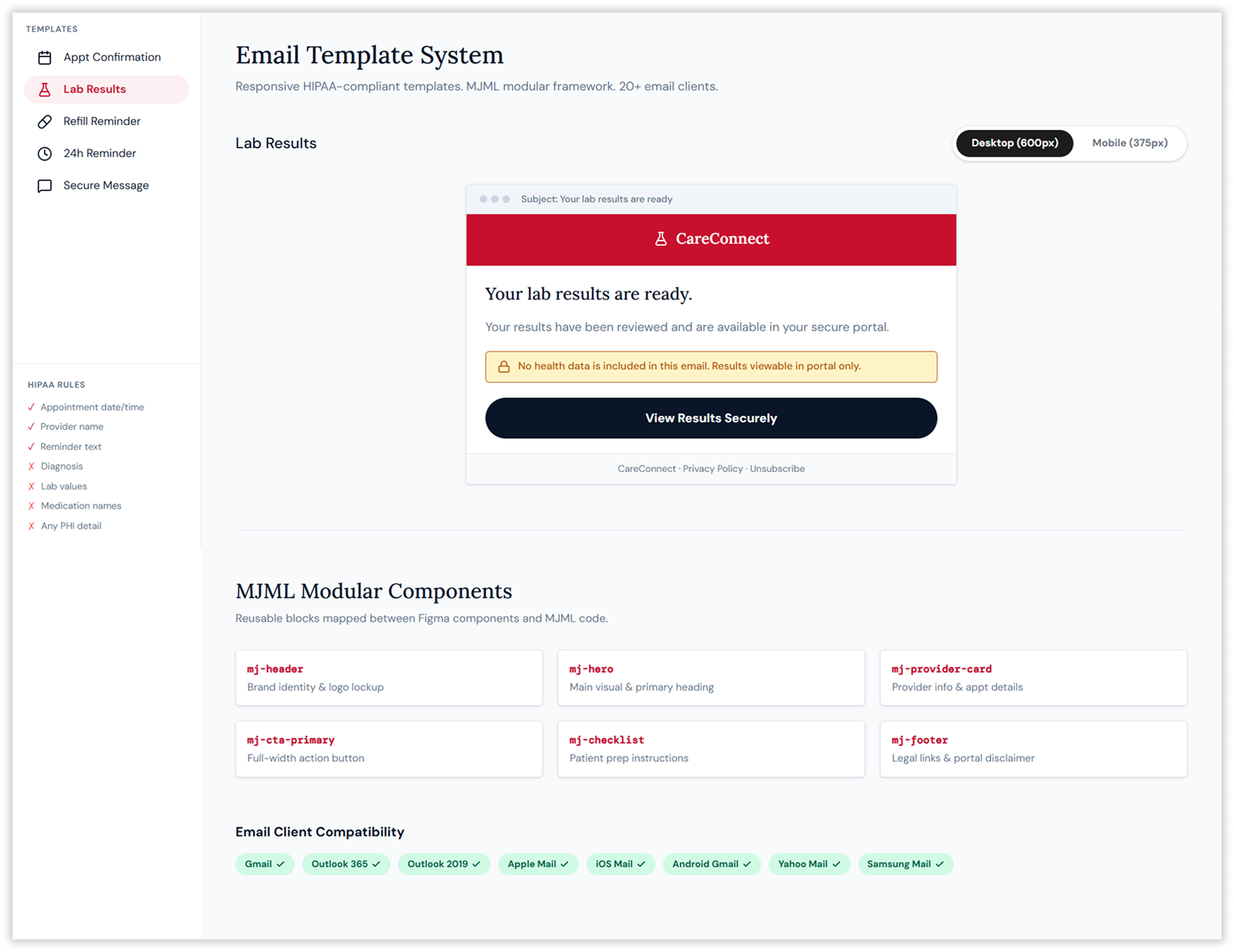
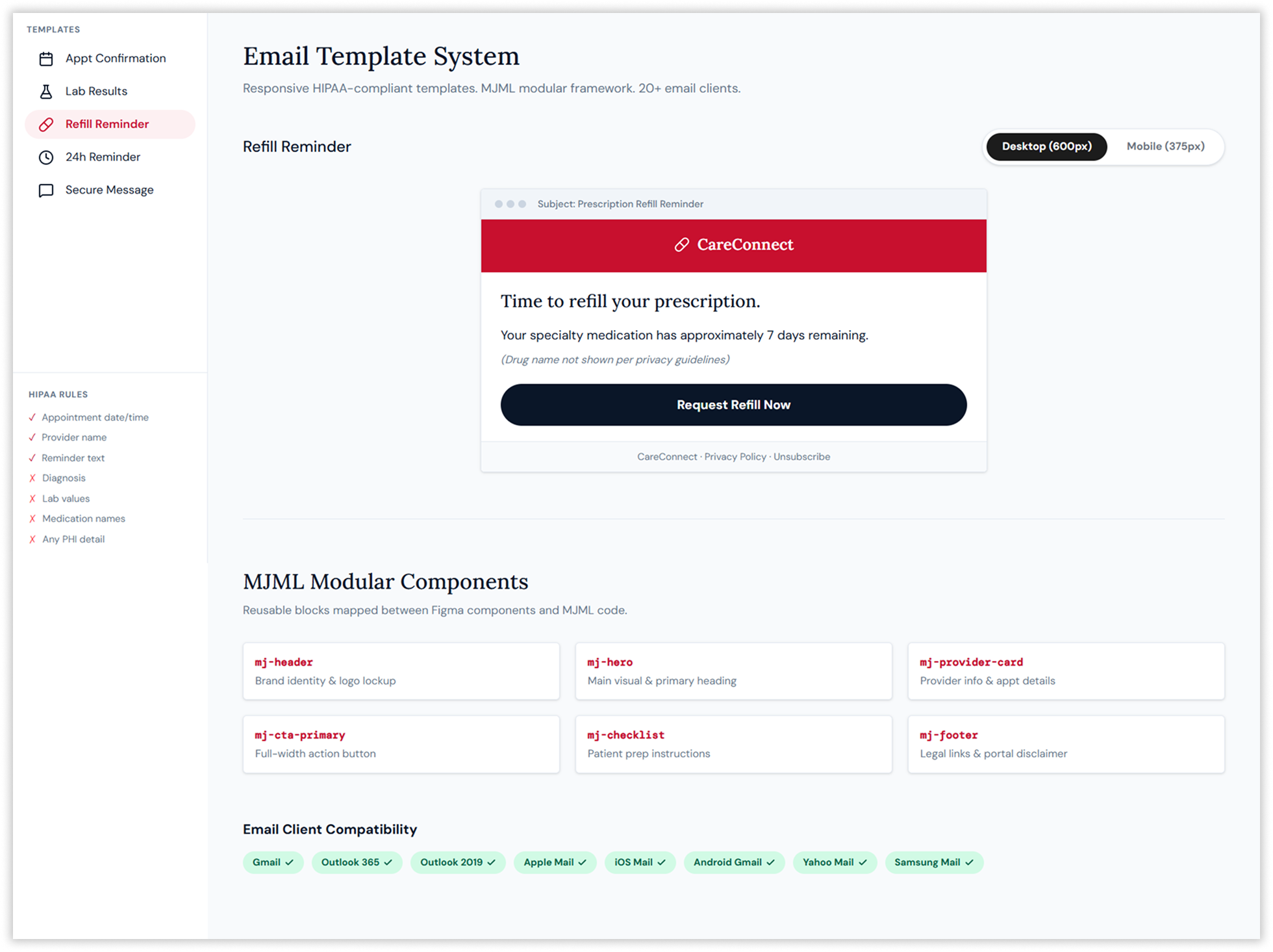
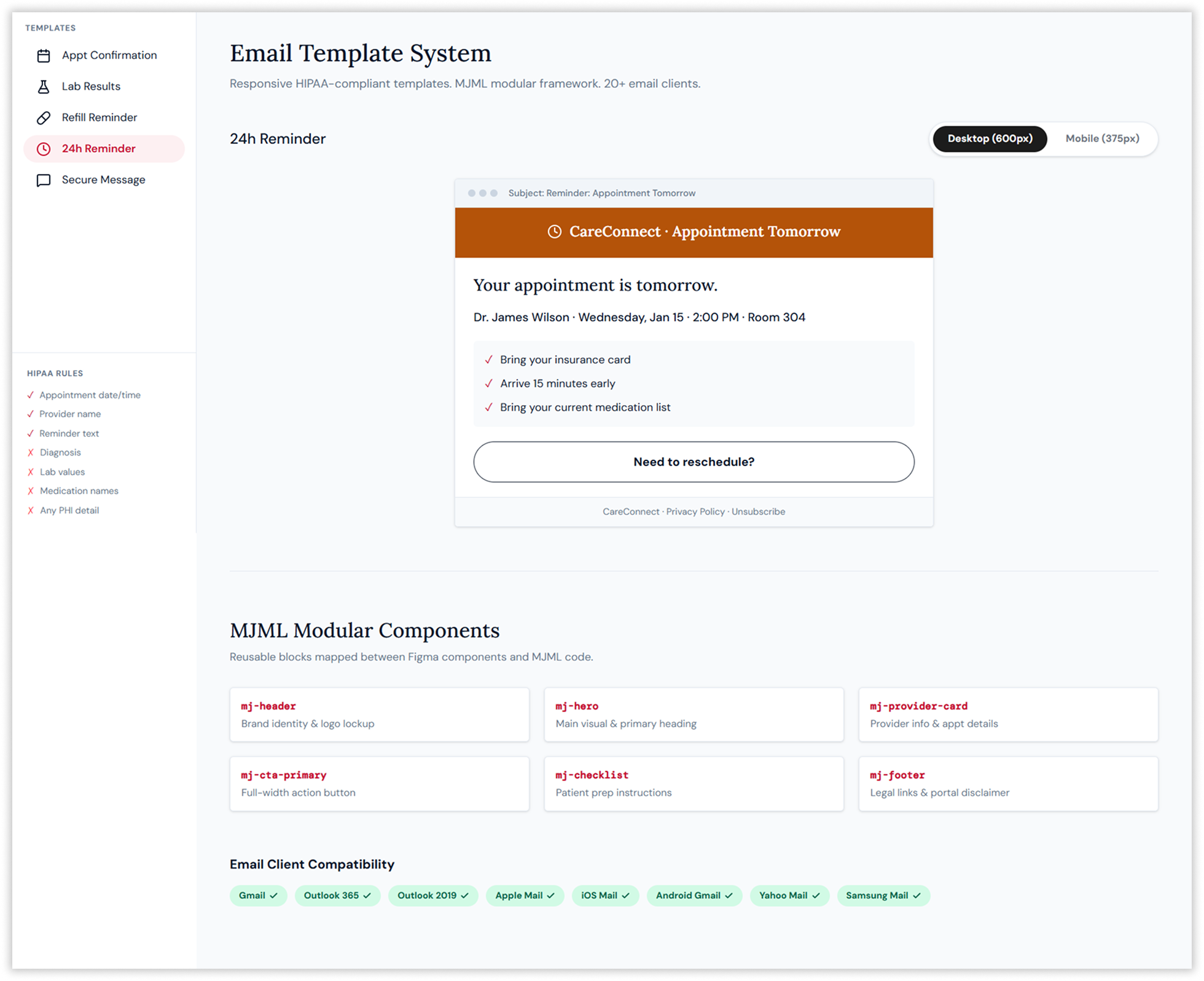
Designing Systems, Not Screens
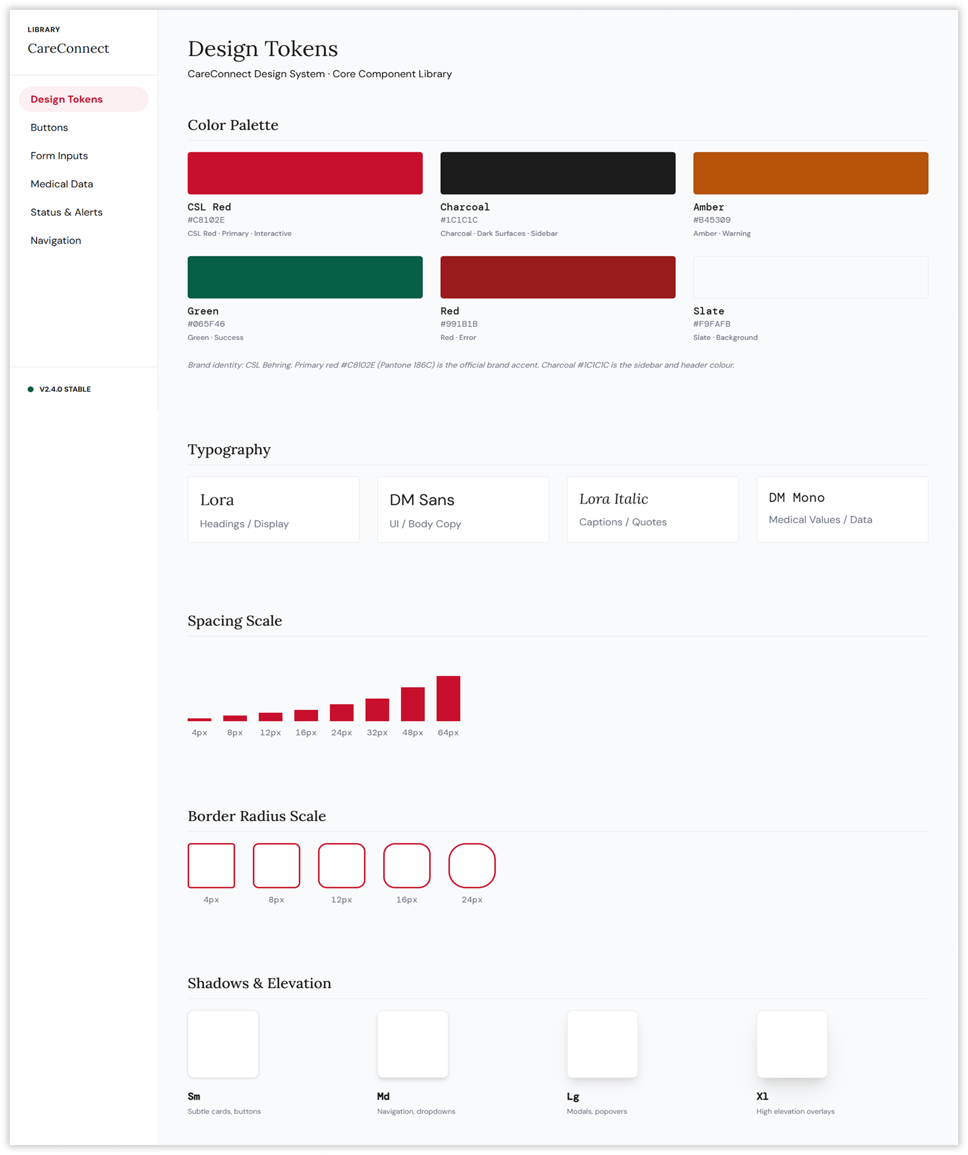
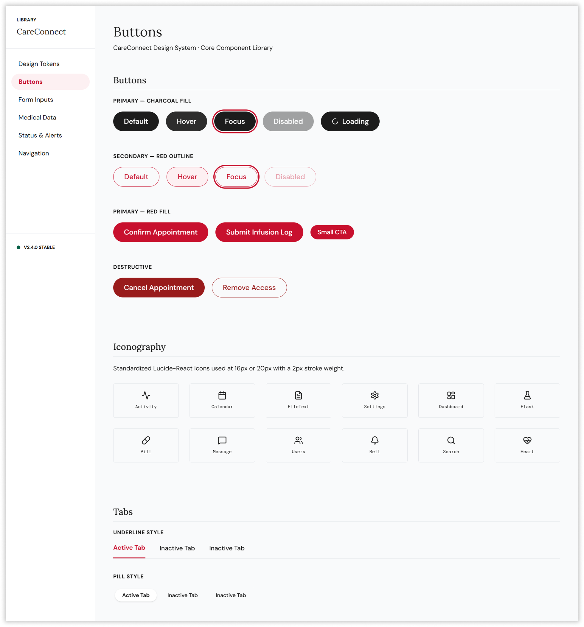
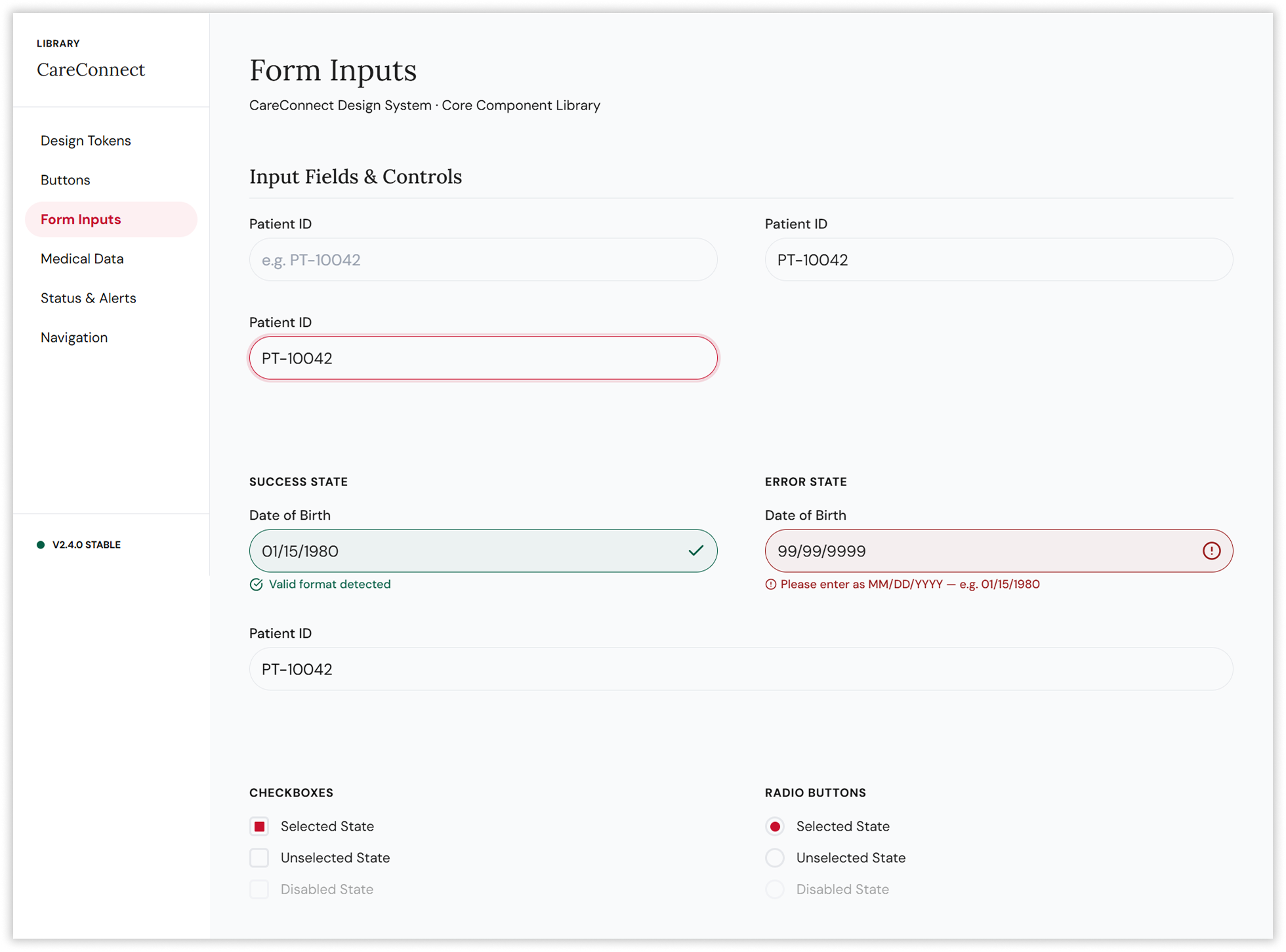
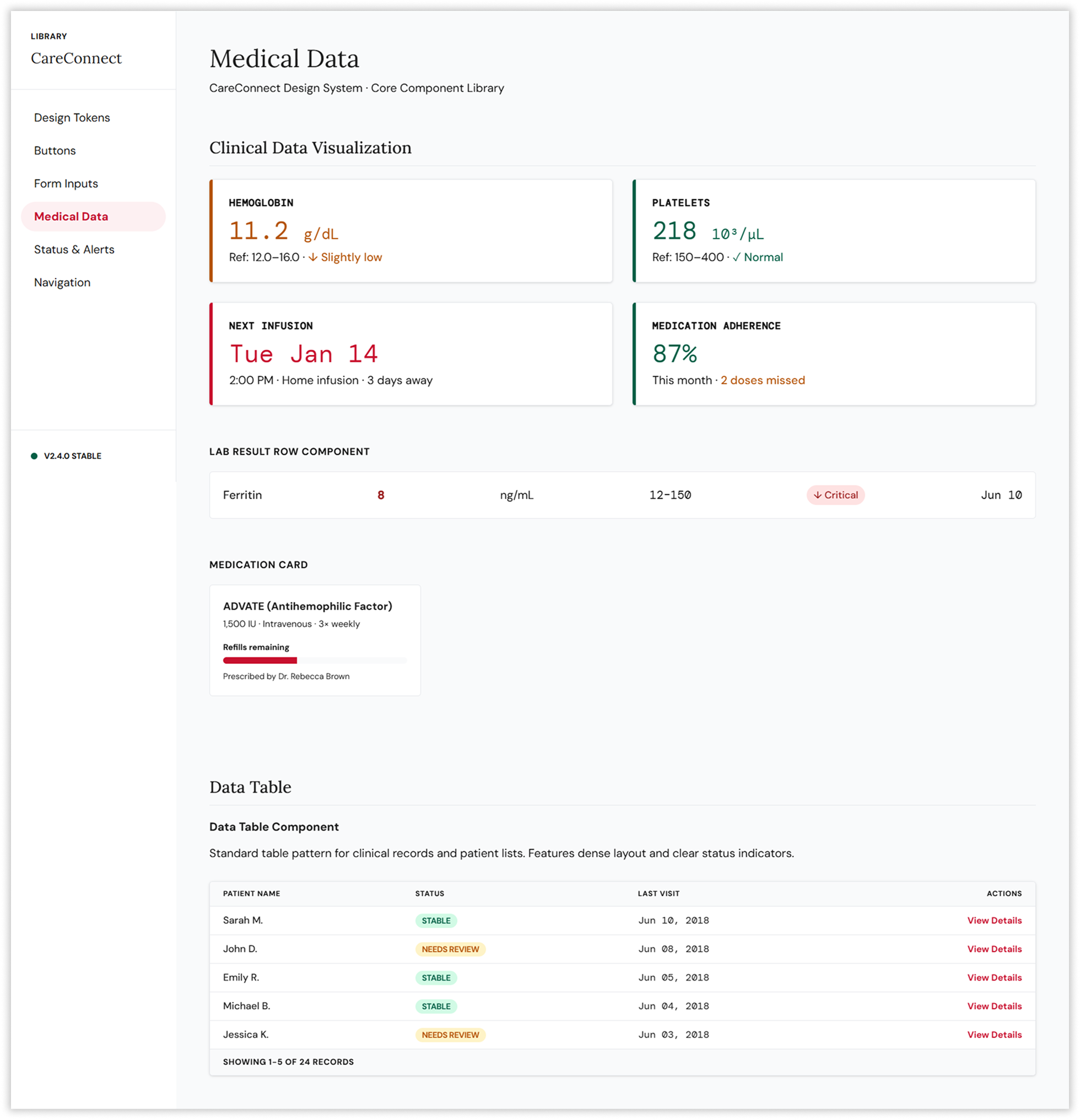
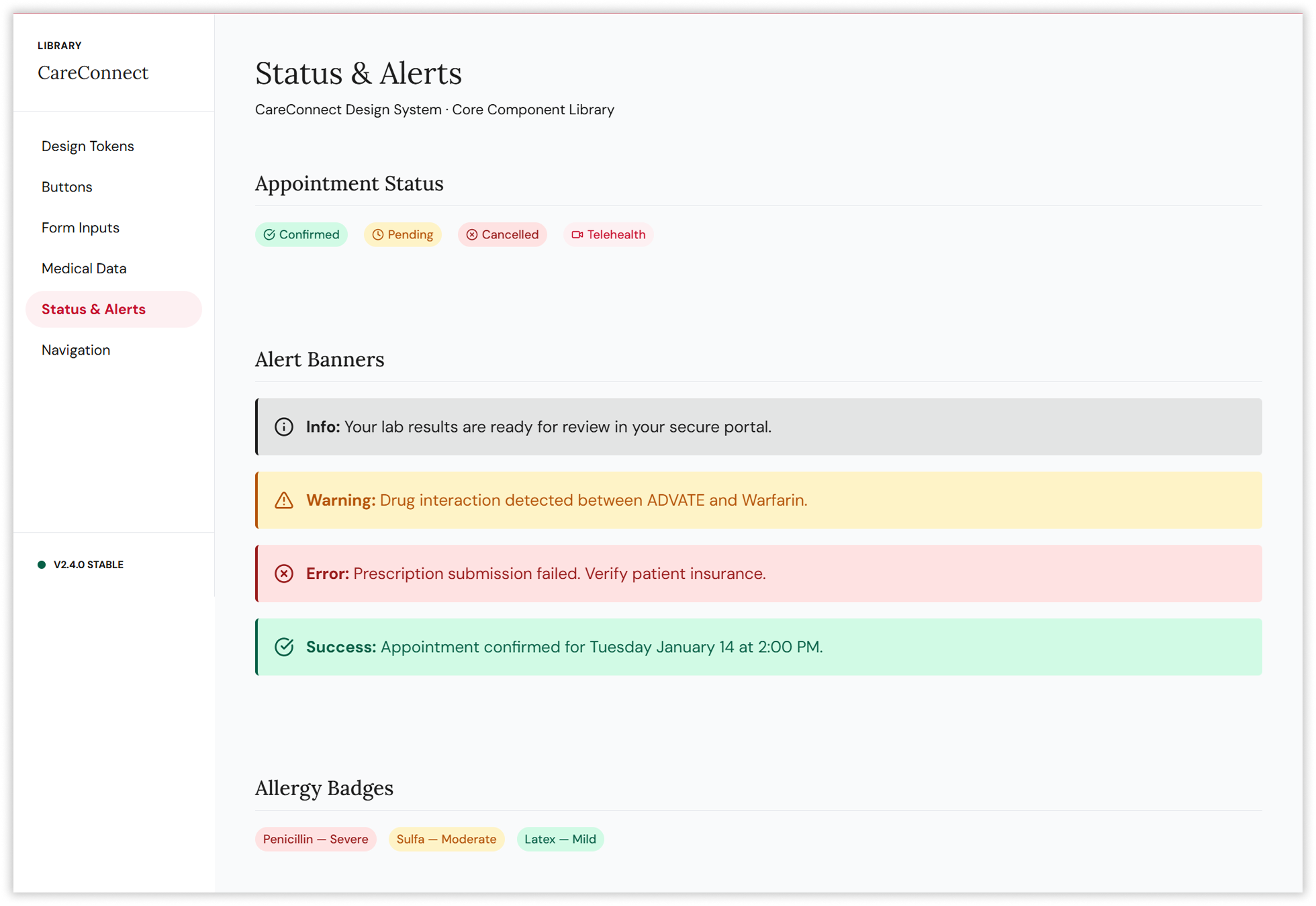
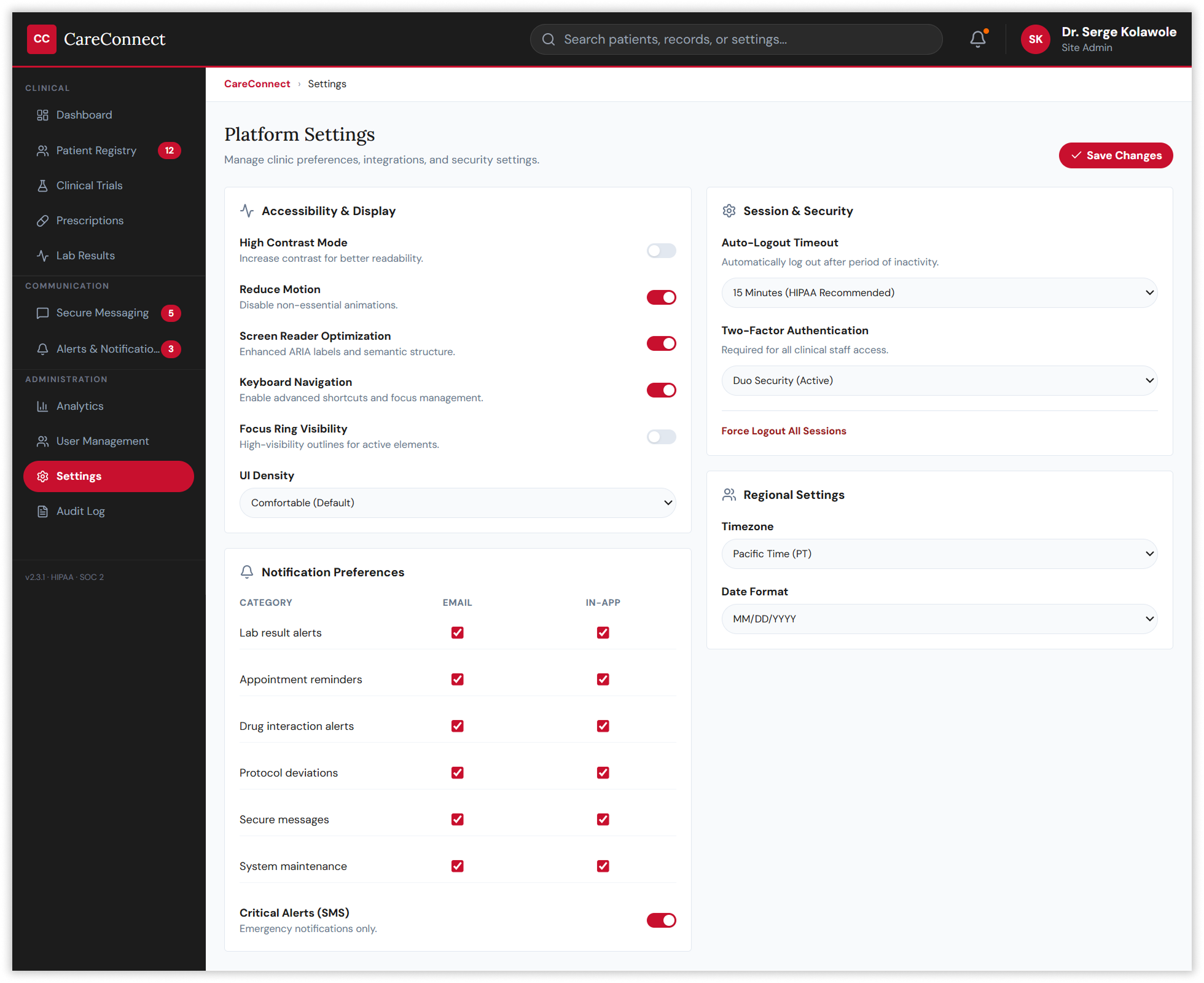
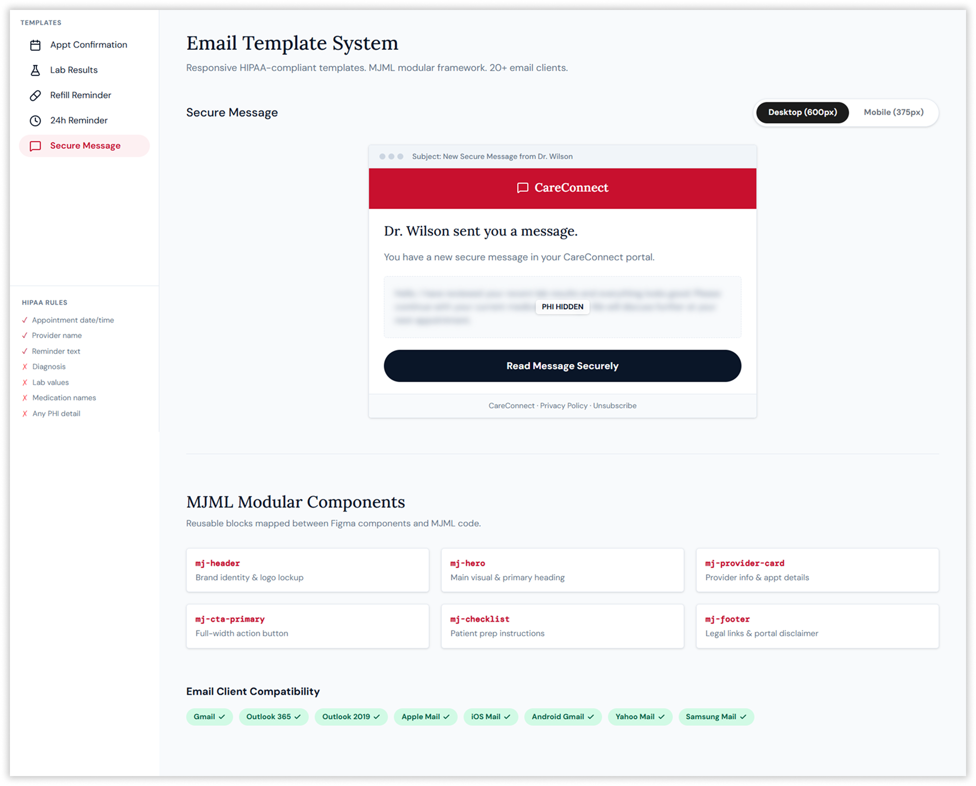
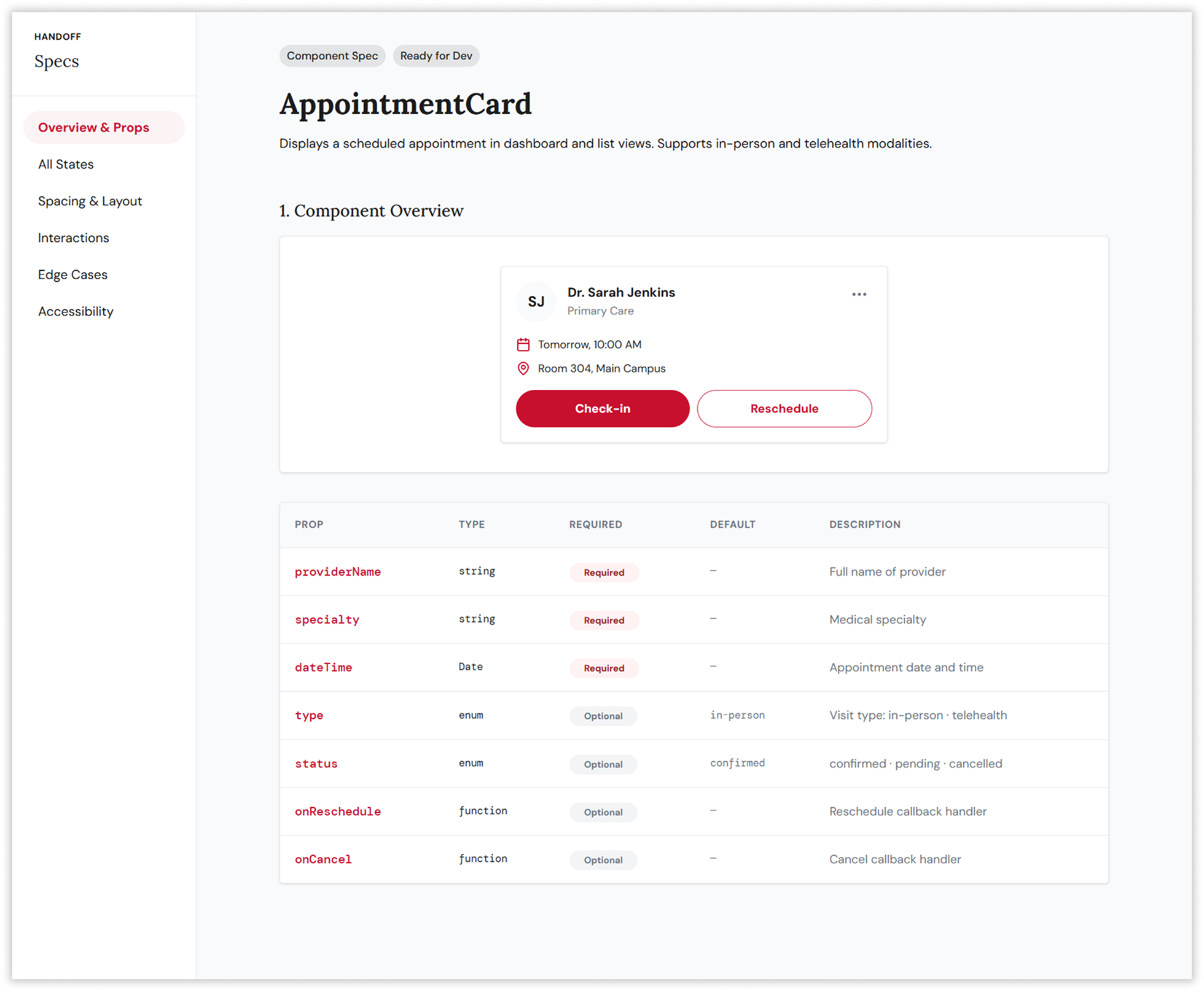
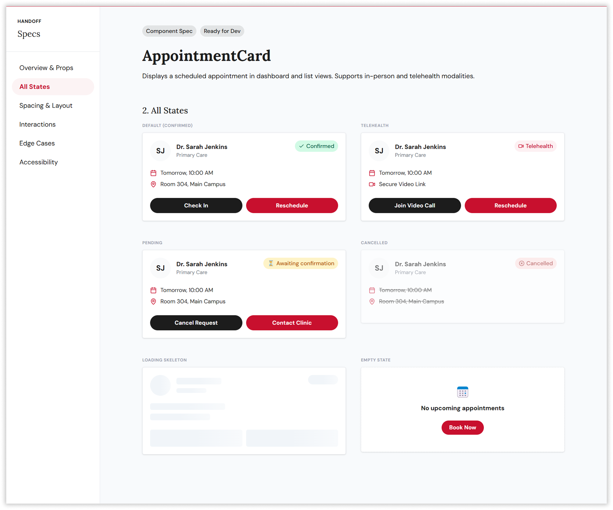
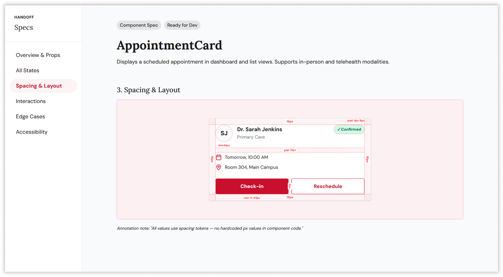
Rather than designing individual screens in isolation, the strategy prioritised building a scalable design system first — 180+ components across six categories, underpinned by a JSON-based design token architecture operating across three tiers: primitive, semantic, and component. This three-tier hierarchy enabled white-label customisation across six global markets (CareConnect US, EuroHealth EU, APACare APAC, and three additional regional variants) from a single codebase, ensuring that a button’s background colour could be updated globally by changing a single token value, not hunting through hundreds of component files.
04. The Solution
Designing for biopharmaceutical patients means designing for people who are already carrying a heavy load. Every interaction on CareConnect happens in the context of a serious, often lifelong condition. The solution was not simply a more usable interface, it was a deliberate act of reducing burden: stripping away every unnecessary click, surfacing the right information at the right moment, and building accessibility into the foundation rather than bolting it on as an afterthought.
The patient-facing portal was designed around a single governing principle: every person using this product is managing something serious, and the design must reduce cognitive load, not add to it. The dashboard greeted Sarah by name, surfaced her haemoglobin reading with a clear amber indicator and reference range, showed her next infusion in three words, and displayed her monthly adherence at a glance — all before she had scrolled.
The medication tracker used a weekly grid with clear taken, missed, and upcoming states. Lab results were encoded using pattern, colour, and label simultaneously — never colour alone — meeting WCAG 2.1 Level AAA compliance standards that made the platform usable for Marcus and users with visual impairments alike.
The booking flow was redesigned using three-step progressive disclosure, revealing only what was needed at each stage. Step one asked the patient to choose a care type — and nothing more. The calendar appeared only once a provider was selected. Insurance verification was pre-filled from profile data, requiring only confirmation. Auto-save ran silently throughout, preventing the data loss that had been a primary driver of abandonment.
The result was a 41% improvement in booking conversion and a 34% reduction in form abandonment — outcomes validated through five rounds of unmoderated testing with over 300 participants across UserTesting.com and Maze.
The provider dashboard was designed for the reality of clinical work: high information density, time pressure, and zero tolerance for interface errors when prescribing. The three-column layout — patient queue, EHR detail panel, and quick actions — kept everything within reach without requiring navigation. The SOAP note editor supported clinical shorthand expansion. The e-prescribe modal flagged drug interactions with documented severity levels and required override justification before submission. The secure messaging centre, built with HIPAA-compliant encryption and seven-year retention, provided a dedicated clinical communication channel between providers and patients with message type classification for urgency triage.
The 180-component library was built in Figma using Auto Layout, Variants, nested instances, and component properties, enabling four product teams across the United States, Europe, and APAC to work from a single source of truth. The design token architecture generated platform-specific outputs — CSS custom properties, SCSS variables, iOS Swift constants, and Android XML — from a single JSON source via Style Dictionary, eliminating the manual translation errors that had previously created visual inconsistencies between web and native implementations.
05. The Impact
The redesign produced results that were validated quantitatively at every stage.
At the system level, the design token architecture and scalable component library enabled the platform to launch simultaneously across six global markets with full white-label customisation capability, supporting four product teams without requiring individual design intervention for each regional variant. The MJML email template system, tested against more than 20 email clients, delivered consistent rendering across Gmail, Outlook, Apple Mail, and eight additional clients while maintaining strict HIPAA compliance — never including PHI in email content.
06. Reflection
CareConnect remains one of the most consequential design project I have worked on, not because of its technical scope, but because of who it was built for. The constraints of HIPAA compliance, accessibility requirements, and the clinical complexity of the domain forced a rigour that surface-level portfolio projects rarely demand. Designing for Marcus — low digital literacy, needing large text, accessing the portal monthly — and for Dr. James — expert user, multiple daily sessions, zero tolerance for unnecessary clicks — from the same component library required genuinely difficult design decisions rather than style choices.
The work also reinforced something I believe deeply about the relationship between research and design: the navigation architecture that improved findability by 68% did not come from design intuition. It came from 75 card-sorting participants telling us, independently, that they expected lab results to live under health information rather than records. The design was the last step, not the first. The facilitator work — running design thinking workshops with clinicians, compliance officers, and patients in the same room, managing the tension between what engineers wanted to build and what patients needed to use — was as important as any wireframe.
If I were to return to this project today, I would prioritise the caregiver proxy access problem earlier. Elena’s need to manage her mother’s care plan without a separate login was acknowledged in research but addressed only partially in the final platform. It represents the kind of edge case that seems minor in a sprint planning session and significant in someone’s actual life. That gap stays with me as a reminder that designing for the average user and designing for the most vulnerable user are rarely the same task.
Project Metadata
3 UI/UX Designers
6 Frontend Engineers
2 Backend Engineers
1 Product Owner
68% Increase in Findability
55% in Data Interpretation Time
34% Reduction in Form Abandonment
Next Project
End-to-end enterprise UX for State Street’s internal portfolio management and trading platform
Transforming data analysis workflows for Fortune 500 companies through research-driven dashboard redesign and accessible visualizations.